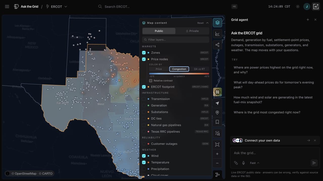
Color the ERCOT map by congestion
Recolor the price nodes by congestion, compare day-ahead to real-time, and replay how it moves across the day.
Under Price nodes in Map content, a new Color by control recolors the map. Congestion shades each location by its price relative to the system-wide energy price (SCED system lambda), over a smooth field clipped to the ERCOT border — cool where the grid is oversupplied, warm where it's constrained and expensive. When nothing is binding it stays quiet, so a busy map means a genuinely separated grid.
DA vs RT colors each node by how much more (or less) congested it actually settled in real time than the day-ahead market priced — the nodal basis that shows where the day-ahead forecast missed. Relative contrast re-normalizes the scale to the moment, so even a calm hour reads.
Press play or drag the timeline to watch it evolve across the day. It's built entirely on ERCOT's public data — an observational view of where the grid is under stress, not a power-flow model.