Changelog
The product record of Ask the Grid becoming a national live-grid system: every major market launch, dataset, forecast, agent capability, and way to work with the power system.
19 release chapters · 18 live markets · Since July 25, 2026
October
2026
Canada and Mexico join the grid
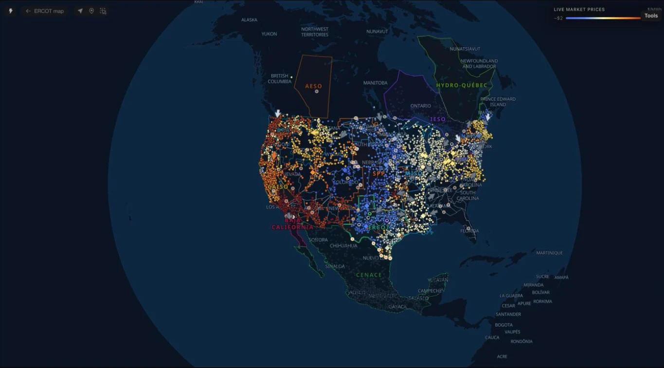
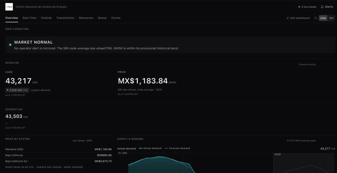
Alberta, Ontario, Québec and Mexico are live beside the US grids, each with its own map and Radar, its own currency and clock, and a North America view that holds all thirteen.
Power does not stop at the border, and the workspace no longer does either. Alberta (AESO), Ontario (IESO), Québec (Hydro-Québec) and Mexico (CENACE) are live in Ask the Grid, each with its own map and Radar and each answerable by the grid agent. Choose one from the grid switcher, where grids are listed by country, or open the North America view to see all thirteen at once.
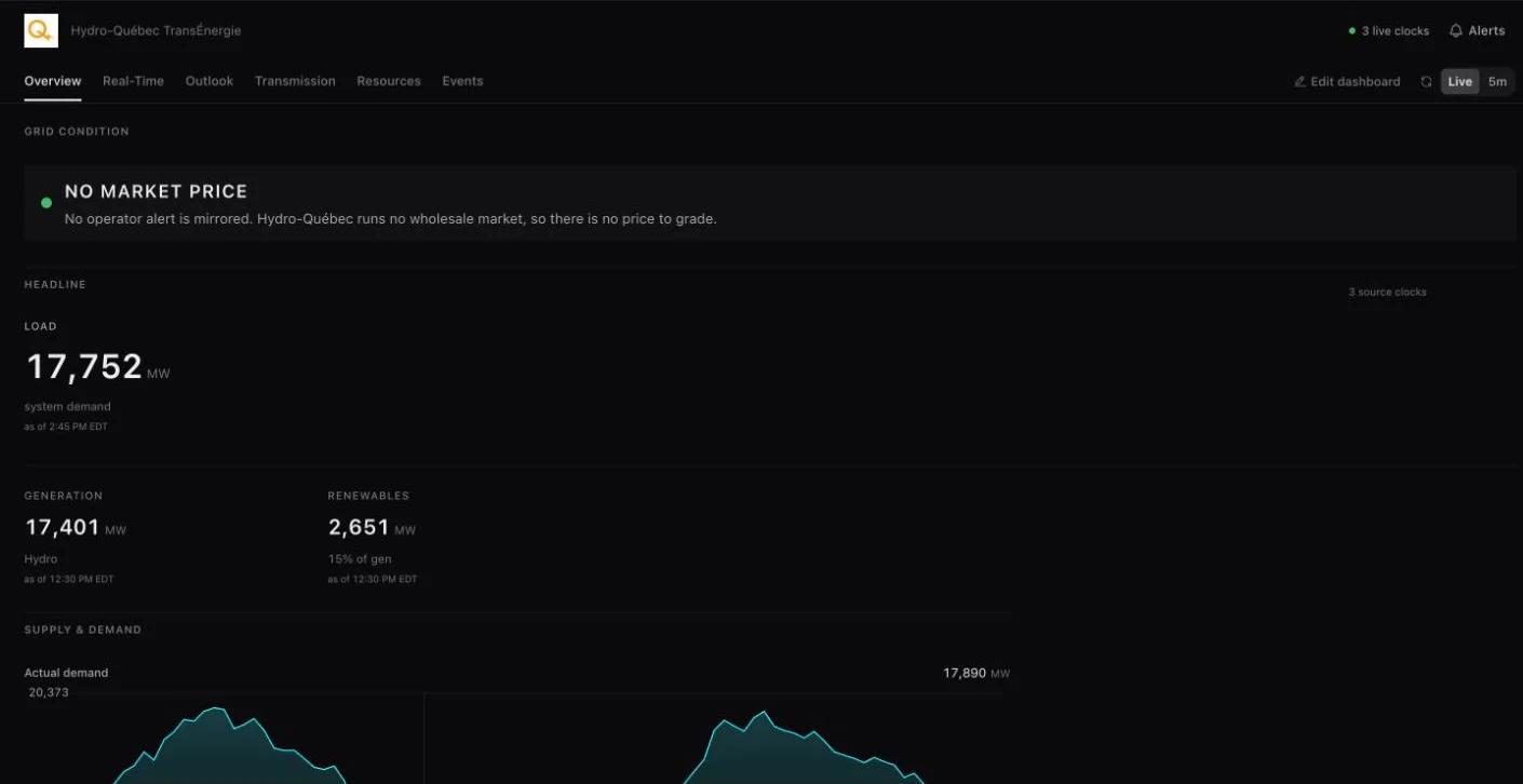
Each grid is read the way its operator publishes it. Alberta and Ontario are priced in Canadian dollars and Mexico in pesos, and each grid's own map, Radar and answers keep that currency. Hydro-Québec runs no wholesale market, so its workspace has no price at all and is read through demand, water and exchanges. Source, unit and update time travel with every reading, as they do for the US grids.
Thirteen grids, three countries
The grid switcher lists every live grid under its country: the seven US markets, Bonneville and Baja California, and now AESO, IESO, Hydro-Québec and CENACE. Each has a map of its transmission lines, substations and plants, a Radar built from the desks its publications can fill, and a market page that says what is covered and at what cadence.
The grid agent answers in each grid's own terms. Ask what Alberta's system marginal price is, how much of Ontario's supply is nuclear this hour, what Québec is sending to New York, or which of Mexico's control regions has the highest demand, and the answer names the publication it read.

One view of the continent
The North America view opens on every live grid at once, so a tie can be followed across a border: New York into Québec, Ontario into Michigan, California into Baja California, Alberta into British Columbia. Each footprint is drawn and labelled, and the grid switcher opens any of them on its own map.
The view's price scale is in US dollars. Mexico's nodes join it converted at the published peso exchange rate for the day, so prices can be compared across the border; on Mexico's own map they stay in pesos. Ontario's nodes are drawn without a colour on this view and take their colour, in Canadian dollars, on Ontario's own map.
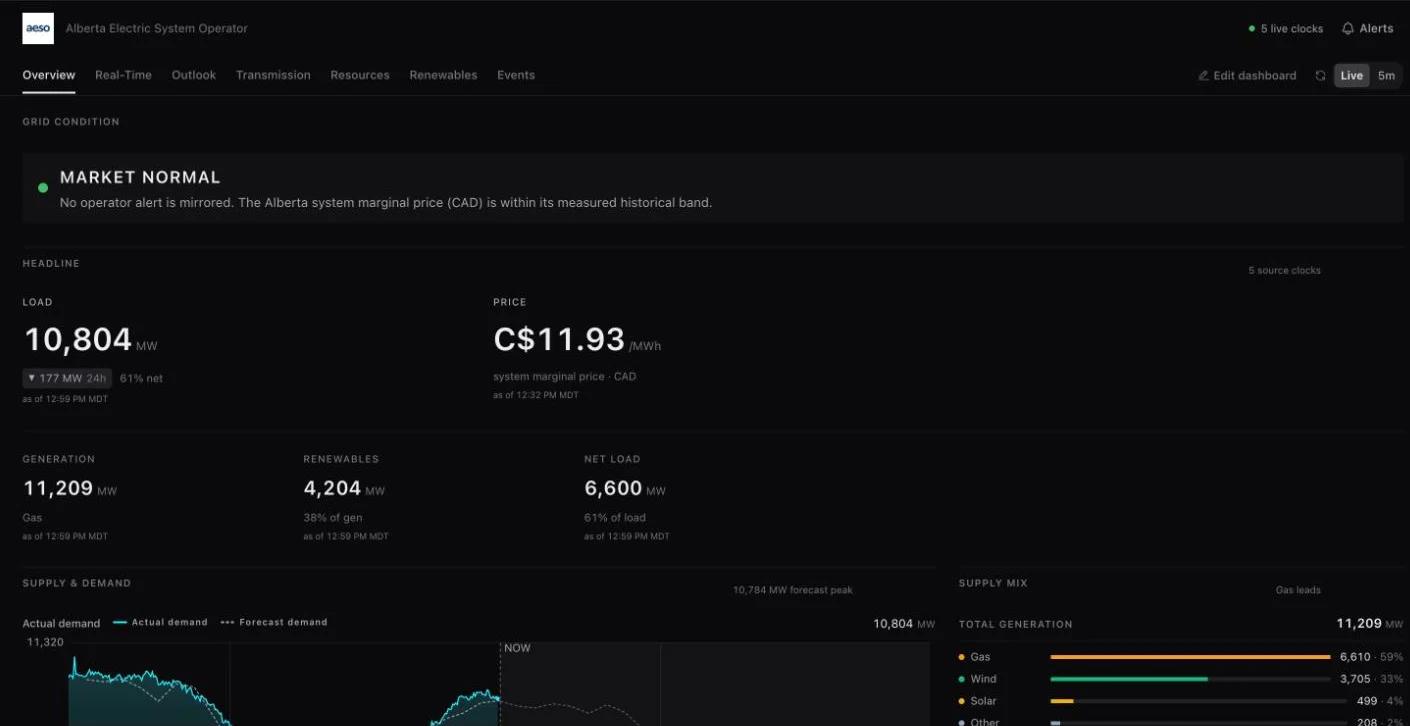
Alberta and Ontario, as two different markets
Alberta has one price for the whole province. Its Radar shows the system marginal price as it changes and the hourly pool price it settles at, load against AESO's forecast, supply by fuel and by unit, wind and solar against AESO's forecasts, and metered flow on the interties with British Columbia, Montana and Saskatchewan. Because there is a single price, Alberta's map has no price nodes.
Ontario's renewed market publishes locational prices, and its map places and colours more than a thousand pricing locations where IESO's own price map draws them. Radar shows the real-time and day-ahead Ontario zonal price, demand, hourly output by fuel, renewables against IESO's forecasts and five-minute intertie flow. Both markets have forecast pages: AESO's load, wind and solar forecasts, and IESO's wind and solar forecasts with the day-ahead price against real time.
Québec, read through water
Hydro-Québec is a balancing area on its own interconnection, joined to Ontario, New York, New England and New Brunswick through converters. Its Radar shows demand every fifteen minutes, generation by source every hour, exchanges with each neighbour, and the flow passing its generating stations. Demand is plotted against the 2019 to 2024 range so today can be placed against past years.
Each tie's reading arrives on its own lag, and generation is published two to three hours after the hour. Those clocks are shown with the readings instead of being smoothed into one timestamp.
Mexico, as one market over three systems
CENACE operates three electrical systems that are not synchronous with each other: the mainland, Baja California and Baja California Sur. Radar shows the day-ahead price for each, never combined, with national demand against CENACE's forecast, demand by control region and settled generation by fuel. The reference price is the average of the mainland's nodes for the hour in force, because CENACE publishes no system price, and it is labelled as that.
Mexico's map draws the national network from Sonora to the Yucatán peninsula. Baja California keeps its own workspace, because it runs on California's frequency and its prices sit across the seam from CAISO's. Real-time prices are published days after the hour, so the price in force on the map is the day-ahead one.
September
2026
Measure the congestion between two points on the grid
Pick a site and the point it settles at, and read the lines that move the spread between them, what a bad day has cost, and what is filed against those lines.
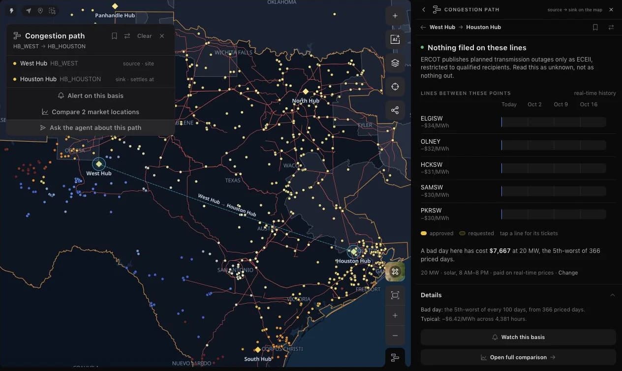
Choose the point where a project sits and the point where it settles, and Ask the Grid measures the path between them. Shift-click two settlement points on the map, or set the pair up by name from Compare, and the Congestion path tool opens beside them with a dashed chord drawn from source to sink. Direction is part of the question: West Hub to Houston Hub is a different path from Houston Hub to West Hub.
The reading answers the questions a desk asks before it hedges basis. Which lines move the spread between these two points, and by how much while they bind? What has a bad day cost at the size and shape of this position? Is anything filed against those lines in the coming weeks? Each answer carries its source, its pricing window, and the market's own limits on what it publishes.
Pick two points, keep the pair
The first point is the source, the site; the second is the sink, where it settles. The map card names both ends and offers the path's own actions: save it, reverse it, set an alert on its basis, compare the two locations, or ask the agent about this path. A saved path belongs in a collection like any other asset, reopens with both ends selected, and appears in each end's Also here list.
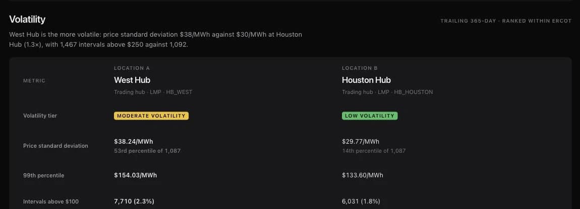
Compare starts the same reading without the map. Choose Congestion path, pick the market, and type each location by name; the comparison page carries the path's reading beside each location's price statistics. The Volatility section ranks both ends within their market by price standard deviation, 99th-percentile price, and intervals above $100, $250, and $1,000.
The lines that move the spread
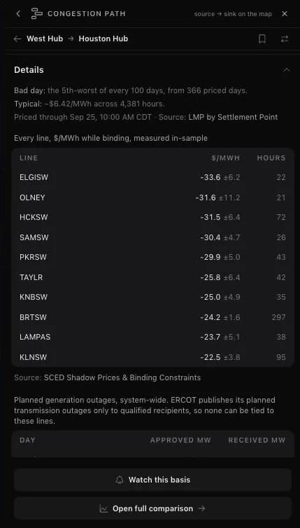
Lines between these points lists the constraints most associated with the path's spread, each with the dollars per megawatt-hour the spread moved while it was binding, the uncertainty of that estimate, and the hours behind it. Constraints that name the same facility are collapsed into one line. It is an association measured on the market's own settled prices, not a network sensitivity, and the panel labels it that way.
The path is measured in the market it settles in, over a trailing year of priced days. A bad day is stated as money at a position you set: size in megawatts, a delivery profile such as solar hours, and the prices it is paid on. The typical basis sits beside it, so the tail and the ordinary day read together.
What is filed against those lines
Where a market publishes its planned transmission outages, the tool lays each line's approved and requested tickets over the coming weeks. PJM's outage schedule is read facility by facility. ERCOT publishes planned transmission outages only to qualified recipients, so the tool says that the schedule is unknown rather than reporting nothing out, and shows ERCOT's planned generation outage capacity instead.
Watch this basis turns the pair into an alert, and Open full comparison continues into the comparison page. In ERCOT, the agent can also answer which settlement points a binding constraint moves, from sensitivities estimated nightly out of five-minute prices and shadow prices.
Read the grid at one point with Here
Here answers the single-point version of the question. Open it from the map's tools or right-click and choose What's here, then click anywhere: the panel names the place, its market and load zone, the five nearest settlement points with their latest prices, the zone's demand against its forecast, the weather in that cell, the nearest plants and river gauges, and grid events and lightning within 25 km.
Every chart in the panel follows the map's time scrubber. Keep as pin turns the probe into a saved point. A location outside every zone or outside the weather grid says so instead of borrowing a neighbour's reading.
Rivers join the grid map
National Weather Service river gauges, their flood thresholds and official forecasts sit on every market map, tied to the hydro plants the water reaches.
Hydro output starts upstream. The River gauges layer puts every current National Weather Service river gauge on the map, coloured by the NWS flood category it is in, so a reader following a hydro fleet, a cooling-water limit, or a flood near a substation can see the water beside the grid it affects.
Each gauge carries its stage and flow, its flood thresholds, the NWS forecast where the office issues one, and its observed history. Gauges sit inside their market's map, connect to the hydro plants they are near, and are available to the agent, so the river is part of the same investigation as prices, outages, and generation.
The river layer draws what matters at each zoom
Zoomed out, the layer draws featured gauges: those at or near a flood or low-water line now or in the forecast, official NWS forecast points, and gauges within 10 km of a hydro plant. Zoom in and every current gauge appears. Gauges that are out of service or have stopped reporting stay off the map but remain reachable from search and the Here tool.
A single-market map shows the gauges inside that market's footprint, with a margin so border rivers such as the Rio Grande stay in view. The national map shows them all. The layer follows the time scrubber, and clicking a river opens the nearest gauge on it.
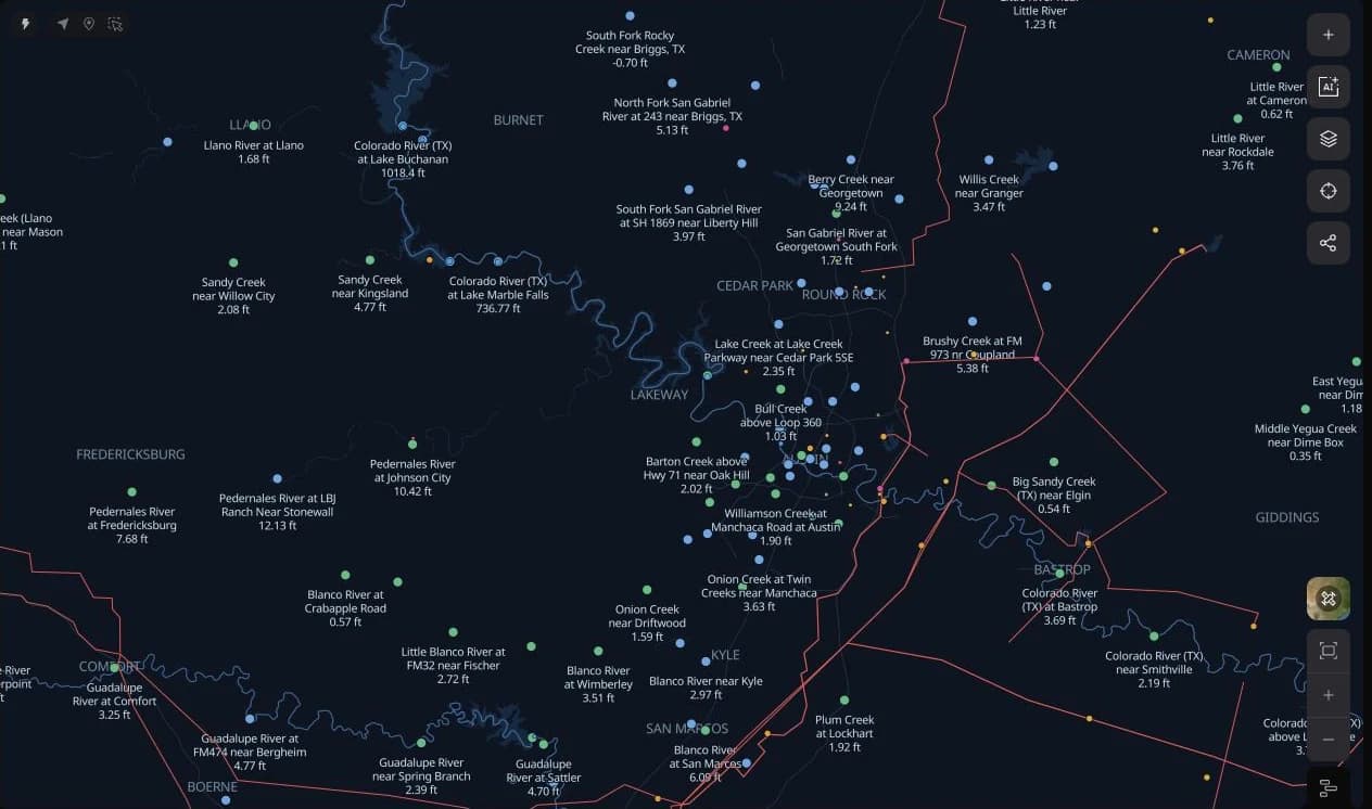
Read a gauge the way the forecast office does
The card leads with the observed stage and flow, the day's trend, and whether flow is above or below its 30-day median. The flood-threshold ladder places the current reading against action, minor, moderate, and major stages, and the forecast crest states the expected peak and its time where NWS issues a forecast.
The chart draws the observed series with the NWS forecast hydrograph beyond it and opens in the chart studio. Observations come from the National Weather Service for every gauge it runs, including gauges with no USGS site. The card also lists the hydro plants within 50 km, noting that a plant found by distance may sit on a tributary.
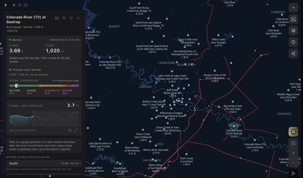
Hydro plants know their river
A hydro plant card gains a River section from the nearest gauge within 5 km, labelled as the reservoir, below the dam, or on the river, and the gauge appears in the plant's Also here list. Plant cards also report monthly generation from EIA-923 filings where the market publishes no plant telemetry of its own.
The gauge tables sit in the data catalog and within the agent's reach, so a question about low water on the Colorado or a crest heading toward a plant can be answered from the same readings the map draws.
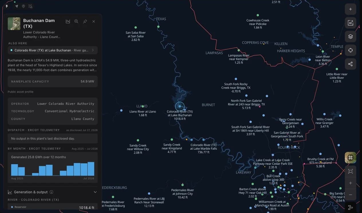
BPA brings the Northwest hydro system into the workspace
Bonneville now has its own map, operating desks, hydro-project readings, and transmission evidence alongside the seven organized US markets.
Start with Bonneville’s balancing area and follow the operating picture from demand and generation to the dams and transmission paths behind it. BPA now has a dedicated map and Radar workspace, bringing the Northwest hydro system into the same research flow as ERCOT, CAISO, NYISO, PJM, MISO, SPP, and ISO-NE.
The workspace keeps the region’s sources in view. BPA publishes balancing-area operations and transmission information; USACE supplies project-level water readings; CAISO publishes the WEIM prices at Bonneville locations. Their units, coverage, and update times travel with the readings, so a five-minute price and a daily transmission workbook can be interpreted on their own terms.
A balancing area on the map
Choose BPA from the balancing-area section of the grid switcher. Its map brings together utility territories, regional transmission and substations, generation, river gauges, and operator events. Named interties put the Northwest’s connections to neighbouring systems into geographic context.
BPA is a balancing authority. WEIM price locations retain CAISO as their publisher, while BPA’s own load, generation, and transmission feeds describe its operating footprint. That distinction remains visible as you move between a map selection, its source, and the agent.
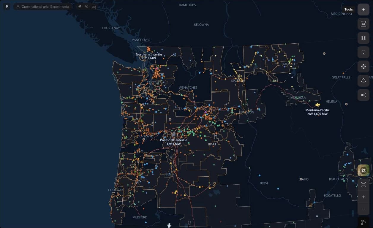
An operating desk built around hydro
Radar opens with demand, a real-time price reference, generation, renewables, and net load. Supply and demand charts sit beside the generation mix, allowing a reader to see how the current balance is being met and when each source last updated.
Use the Transmission and Events desks to continue into published transfer interfaces and scheduled outages. The event record carries the affected facility and the operator’s reported status, linking the broad operating read to a named piece of infrastructure.
Follow the water through named projects
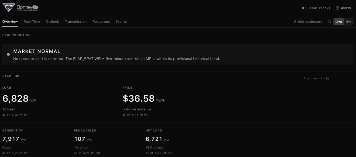
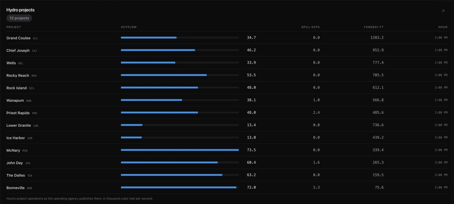
The Hydro projects panel gathers outflow, spill, forebay elevation, and the reporting hour for named projects along the Columbia and Snake Rivers. Expand it to compare Grand Coulee, Chief Joseph, McNary, Bonneville, and the other available projects in one table.
Outflow and spill are reported in thousand cubic feet per second; forebay elevation is in feet. These are project-operation readings from the publishing agency. Their timestamps let you compare the hydro system without treating every row as a simultaneous sample.
Read each path against its limit and its plan
An intertie card shows how the path has run over the trailing week, each hour drawn against the transfer limit that governed the direction it flowed, because BPA restates its limits through the day. The card also lists the work booked against the path from BPA's rolling-year outage plan, under the path names the map already uses.
Radar raises an interface-loading finding when an AC path runs at 80% or more of its directional limit, and a critical one at 95%, and Alerts can follow it. Three BPA Views open the region's transmission map, its power outages, and its interconnection queue.
Grid findings become evidence you can follow
Inspect what triggered a finding, distinguish recorded episodes from historical replay, and follow its activation, escalation, and resolution through Alerts.
A finding can now carry an investigation beyond the current dashboard. Open it from Today or Radar to inspect the comparison, source clocks, market scope, and calculation that made it material. Follow that same finding into Alerts, or use the Insights API to examine its recorded history and evaluate detectors over available historical inputs.
The workflow connects a current condition to evidence and subsequent change. Operator notices retain the operator’s terminology and affected region; calculated findings identify the inputs and reference they compared. An observed value, a forecast target, the time of detection, and the time a source published its evidence remain distinct.
See what was compared
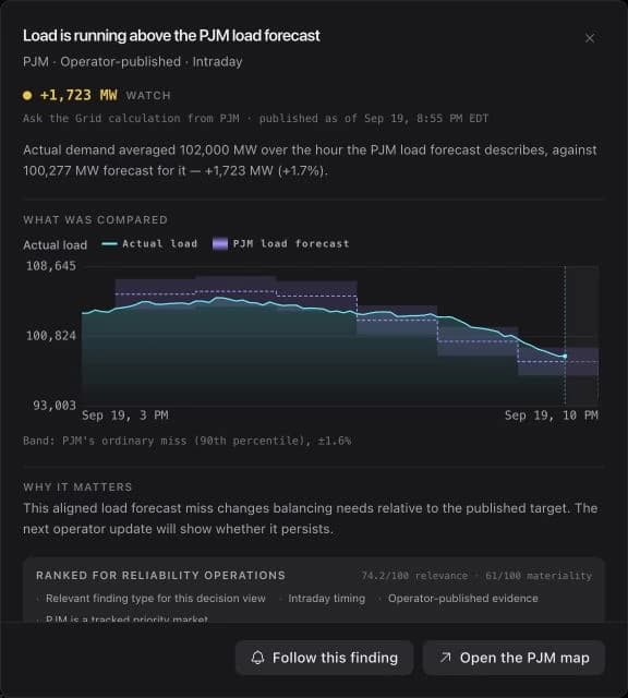
Open a calculated finding to read its evidence chart beside the headline. A load-forecast miss, for example, compares actual demand with the forecast for the corresponding target interval and shows the market’s reference band. The explanation names the difference and the reason it matters.
The evidence record continues into semantics, scope, status, sources, and the evaluated snapshot. It identifies the calculation and its assumptions, including whether the source exposes an issue time. This gives a reader a concrete route from an alerting headline back to the underlying comparison.
Read the operator’s condition in its own terms
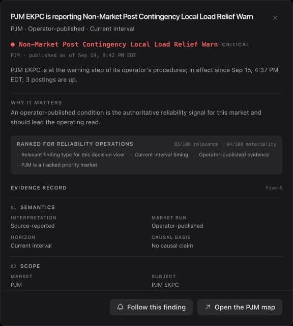
Operator conditions follow each market’s published procedure ladder. Regional notices preserve their affected area, in-effect time, and source wording. A PJM EKPC warning remains an EKPC condition when it appears beside findings from other grids.
Materiality and relevance help order the operating read, while the detail distinguishes an operator publication from an Ask the Grid calculation. The map handoff keeps the market attached so you can continue the investigation in the appropriate grid.
Follow the condition through its next change
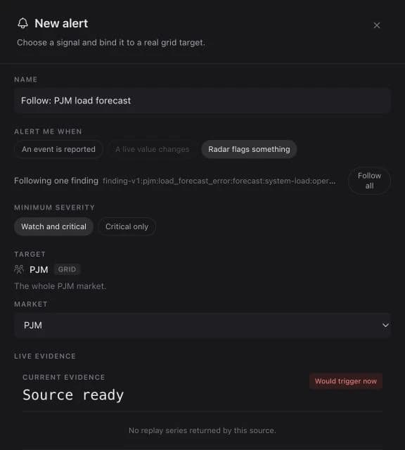
Follow this finding opens a prefilled alert with the finding’s identity, market, and trigger. Choose the minimum severity and saved delivery destinations, then review the rule before creating it. The rule follows activation, escalation, and resolution.
Evaluation runs every minute, with notifications based on transitions. Email, SMS, Slack, and Microsoft Teams destinations are managed in Alerts. The capture shows the handoff and live evidence; the rule is created only when you finish the editor.
Separate recorded history from replay
The Insights API offers two historical questions. Recorded history describes the episodes the system retained as it operated. Replay evaluates the current detectors over historical data available at each evaluation time, within the source history the system can retrieve.
Use recorded episodes to inspect the findings that actually persisted, and replay to investigate how today’s detector definitions behave over an earlier interval. Their mode, source coverage, and evaluation times are part of the result.
A congestion desk in every market
Every market's Radar has a congestion desk. PJM's is built from its day-ahead market: the constraints that bound in the latest delivery hour, with their contingency and marginal value in the sign PJM publishes, and a binding-history curve of how many constraints bound each hour and the worst among them.
Findings can also arrive before the event. Where Metis 1 Preview's median crosses a market's spike or negative-price line at a location that has been quiet, Radar and Today raise a watch finding labelled with the model that produced it.
See how power moves between grids
Flow arrows, directional transfer limits, and settled neighbour interchange connect the map to the operating evidence at each grid’s boundaries.
A market’s balance depends on the systems around it. Interfaces now connect named market seams and interties to a common map and Radar workflow, showing where power is moving, the direction of that movement, and the published limits available for interpreting it.
The reading preserves the kind of evidence being shown. Physical interchange, a market schedule, transfer capability, and settled bilateral reporting answer different questions. Each keeps its operator, sign convention, units, and source time, allowing the reader to investigate a boundary without mistaking one measure for another.
Start at the market boundary
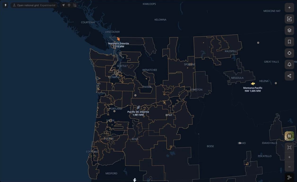
Enable Interfaces on the map to see published market seams and supported tie flows. Arrows point in the direction power is moving. The active grid supplies the operating context, while price-bearing locations remain attached to the market that publishes their prices.
An AC tie with a published directional limit can be coloured by loading. Controlled links, schedules, and unrated transfers retain their own treatment. The arrow is placed at a representative seam or substation; it does not trace the physical route of every line behind the interface.
Read flow against the appropriate limit
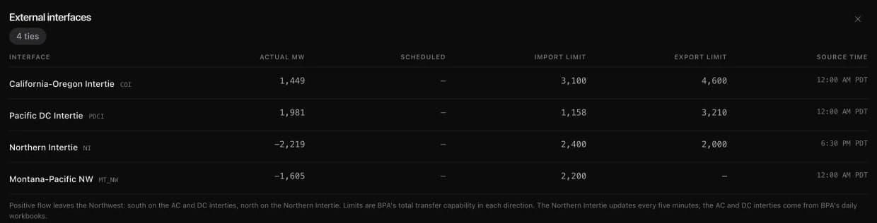
Radar’s transmission tables put actual flow beside the available import and export limits. BPA’s external-interface desk, for example, identifies the California-Oregon Intertie, Pacific DC Intertie, Northern Intertie, and Montana-Pacific Northwest connection, with its sign convention stated below the table.
Source cadence matters. The Northern Intertie updates on a five-minute feed while other BPA readings arrive in daily workbooks. Internal transfer-cut tables similarly show the operator’s published limit in the direction of flow; where a limit is absent, the flow remains a standalone reading.
Include the neighbours around the live feed
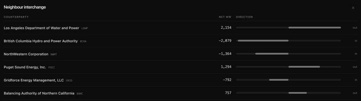
Neighbour interchange extends the view to named balancing-authority counterparties using EIA-930 bilateral reporting. A signed net-MW reading shows whether power left or entered the selected grid during the reported hour, including counterparties outside the directly supported live workspaces.
This is settled federal reporting, typically arriving about a day and a half after the operating hour. Use it to understand the broader pattern of interchange while retaining the faster operator feeds for the current operating picture.
Look ahead to available import capability
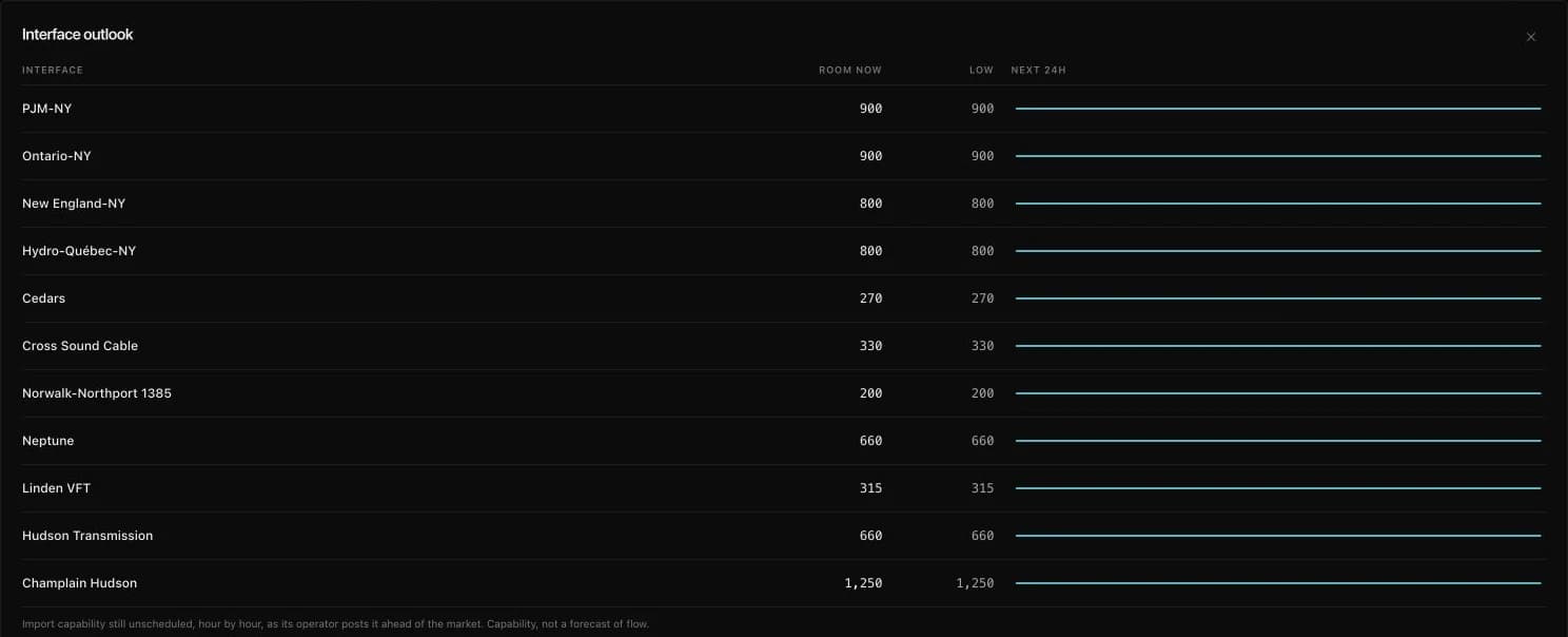
The Interface outlook desk adds the operator’s published availability for the hours ahead. In NYISO, it shows each supported tie’s available import capability, the lowest value in the next-day window, and its hourly shape.
These values describe capability still unscheduled under the operator’s publication. They are distinct from the flow currently crossing the boundary and from a forecast of future interchange. Read the outlook with its source table before using it to frame the next operating day.
Keep the context, then share the answer
Collections carry assets and research context back into the map, while shared agent answers give teammates a focused result they can read and build on.
Grid research rarely ends with a single lookup. Saved collections now connect the assets you are tracking, the context you have kept about them, and the map where you investigate them. Open the collection on the grid, select a member, and continue with its normal asset record while the collection remains in view.
A finished agent answer can also become a focused handoff. Share the latest answer as an unlisted link that preserves its question, charts, cards, and map context. A teammate can read it without an account and start their own follow-up from that evidence, instead of reconstructing the original investigation.
Organize the work around a collection
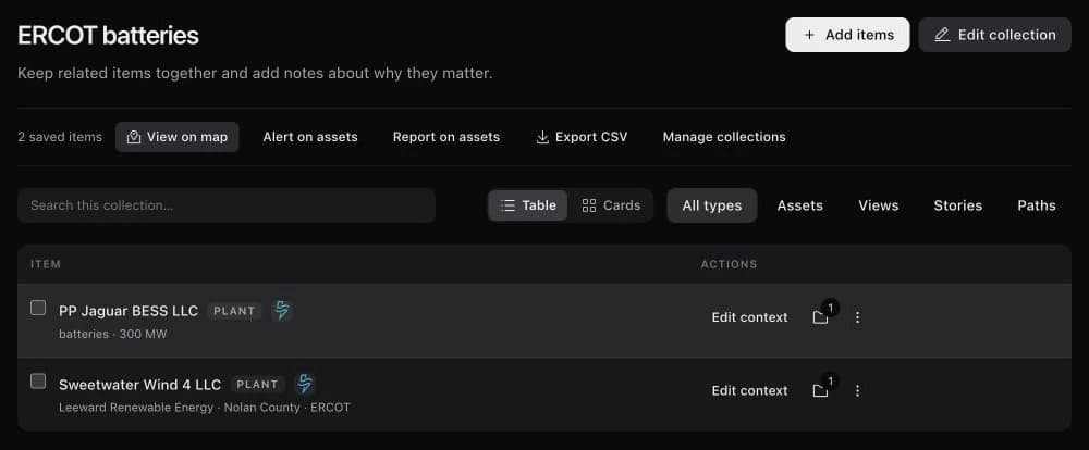
Group assets, map views, stories, and saved paths around a question or portfolio. Collection-specific notes and custom fields preserve why an item matters to that piece of work. The same saved asset can belong to another collection with different context.
A collection with assets offers direct handoffs into the map, alert setup, and report setup, plus CSV export. Review each destination’s target and configuration before creating a monitoring rule or schedule.
Carry the collection onto the grid
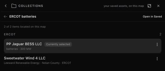
View on map opens the Collections rail, highlights located members, and keeps the collection available while you inspect ordinary asset cards. The rail marks the currently selected asset and identifies how many members are located in the current market.
Items from other markets and saved references keep their own place in the collection. The grid agent can retrieve your current saved library and collection context, so subsequent questions can refer to the assets and notes you have already organized.
Give someone the answer and its starting point
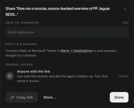
Share latest answer creates an unlisted, read-only snapshot of the newest finished answer. It includes the question, answer content, charts and cards, and the map view from the investigation. Anyone with the link can read it; your first name is shown.
Copy the link, send it to named teammates, or post through a connected Slack or Microsoft Teams destination. The recipient’s follow-up starts their own conversation with the shared answer attached. Other turns from the original conversation are outside the shared snapshot.
See every collection on the map, and what is reaching it
Saved assets carry a badge in their collection's colour on every map, and the Saved assets layer row turns them on together. Each collection has its own show and hide control, a market's map says where the members it cannot draw are, and one switch dims the rest of the map so only your collections stand out. Infrastructure within 5, 10, 25, or 50 miles draws the transmission lines, substations, and plants around the collections you are showing.
Radar findings and operator postings that reach a saved asset are tied to it, with the reason they apply and, where the arithmetic allows, the effect in $/MWh at the asset's own settlement point. They appear on the collection page, the asset profile, the Collections rail, Radar and Today cards, alerts, the MCP server, and the grid agent.
Metis 1 Preview, the Parisi Labs price model, is live
A full distribution of prices for every 15-minute interval over the next 24 hours, at nodes across ERCOT, CAISO and NYISO, scored in public and built into the map, Radar, alerts, the agent and the Forecast API.
Metis 1 Preview is the Parisi Labs price model, and it is live across Ask the Grid. It reads recent and day-ahead prices together with the grid conditions around each location, then forecasts a full probability distribution for every 15-minute interval over the next 24 hours. It is re-issued hourly for settlement points across ERCOT, CAISO, and NYISO.
A distribution answers questions a single number cannot: how wide the plausible range is tomorrow evening, how much weight sits in the spike tail, whether a negative price is possible at midday. The model's output appears wherever a price does, with its issue time and build attached. It is scored in public against what the market settled, and served over the same Forecast API the product uses.
Explore the shape of the outlook
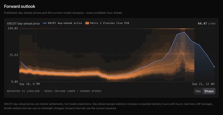
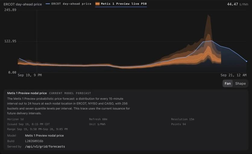
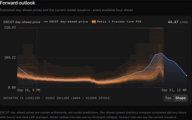
Open a supported pricing location's Performance section, a node's map card, or the chart studio and find the forward outlook. Shape uses density shading to show where the forecast places more probability and where it retains possible lower or higher price outcomes. Fan presents the same uncertainty as nested ranges.
The chart keeps the published day-ahead series beside the model. Read the legend and the visible horizon together: the market settlement and model issuance may cover different intervals, and their lines end with their available data.
Keep the vintage attached
Select the model series label to inspect its source details. The panel identifies issue time, model build, units, resolution, refresh cadence, and the interval covered by the trace. Every forecast value traces back to the issuance that produced it.
The developer console carries the model's page, specification, and a playground that writes the Forecast API request as you build it. Applications read the same forecasts the product draws, over the same endpoint.
Review the hours that actually settled
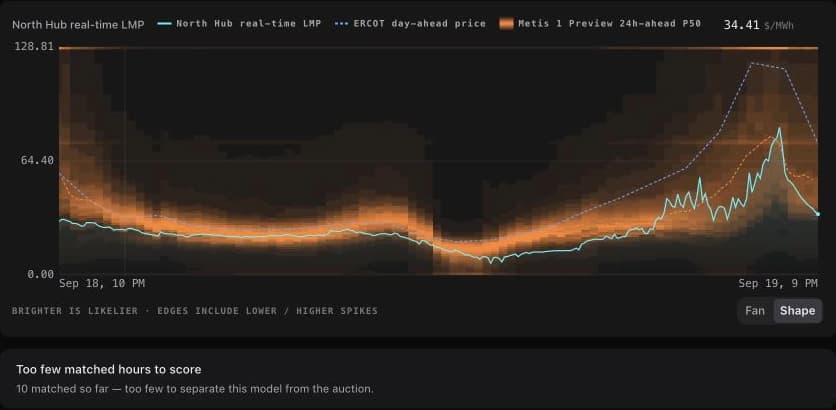
Settlement review aligns observed real-time prices, cleared day-ahead prices, and model forecasts available before delivery. Its trailing window and series labels state the comparison being made, keeping later model updates out of an earlier forecast's evaluation.
Scoring depends on matched observations. When there are too few matched hours, the page says so and keeps the chart for inspection. Use the available sample and the stated vintage basis when interpreting any reported metric.
Scored in public, including when it loses
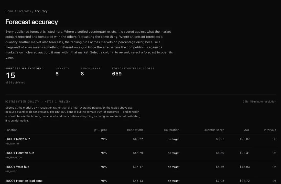
The forecast accuracy page lists every forecast Ask the Grid publishes, scores each against what the market settled, and ranks it against others forecasting the same quantity. Price is ranked within its market. A cleared day-ahead auction stays on the page as the bar and is kept out of the head-to-head verdict, because it is a market result rather than a forecast issued at the same time.
Differences come with an interval, so a tie is an answer the page can give. The distribution-quality table scores Metis 1 Preview at its own 15-minute resolution, showing whether its p10 to p90 band holds the share of outcomes it should and how wide that band is.
Built into the rest of the workspace
The forecast volatility layer paints the width of the forecast distribution across the map from now forward, on single-market and national maps. On a market's own map, scrubbing into the future colours each node by its forecast price. The agent can screen a whole market by band width, upside tail, or negative-price risk to answer which nodes could spike tomorrow.
Radar and Today raise watch findings when the model's median crosses a market's own spike or negative-price line at a location that has been quiet. Alerts can watch the forecast price at a node, labelled as a preview model everywhere it appears. Any signed-in account reads the forecast at ERCOT hubs and load zones and CAISO trading hubs; other settlement points come with an enterprise plan or API access.
Open any chart in the chart studio
Any chart, Radar widget, agent chart or map card opens at full size, with a time rail that travels, the numbers behind every line, where each series comes from, and ways to take it with you.
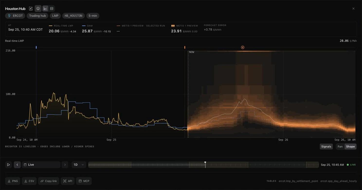
A chart on a card is a glance; the chart studio is where you read it. Any map info card, Radar widget, forecast chart, or chart in an agent answer opens as a near-full-screen panel. The same data is drawn at a size where the day-ahead steps, the real-time spikes, and the forecast distribution can be read against each other.
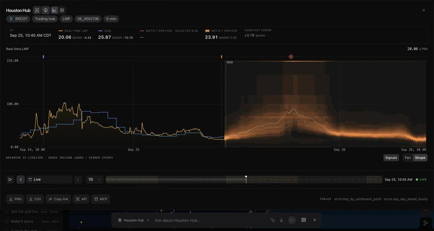
The studio is built for the next step after seeing something. Move through time on the map's own time rail, switch to the numbers behind every line, check where each series comes from, then take it with you as a PNG, a CSV, a link, or the same series over the API or MCP. The grid agent stays beside it with the chart as its subject.
Read the chart at size, at the instant you choose
The header states what the data is: market, kind, location id, and cadence, with the market linked. The values box lists every drawn series at the cursor and reads the value in force at that instant, so an hourly day-ahead price holds for its hour rather than jumping to the next one. Day-ahead prices are drawn as hourly steps because a cleared price steps and does not ramp.
The time rail is the map's own: day boundaries, the daylight band, where forecast begins, and where now is. On price series, stepping back loads that day from the warehouse rather than only moving a cursor over what the card already had. Series with nothing settled to reach back for keep the cursor and offer no date picker.
The numbers, and where they come from
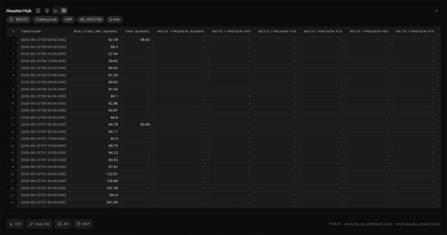
One toggle swaps the chart for a table of every series on the chart, row by row. The CSV comes from the same data, so it cannot disagree with the line on screen; series that do not share timestamps are aligned on the union of their times, and a missing sample stays empty rather than zero or carried forward.
Each series has an About panel naming its publisher and report, the warehouse table with a link to its catalog page, and its cadence. A forecast also names its model, the build that produced it, and the endpoint that served it. The footer lists the tables behind the chart.
Take it with you, or ask about it
Download the picture as a branded PNG or the numbers as CSV, copy a link that reopens the same chart, or copy the API or MCP call that returns the same series. Radar widgets deep-link to their expanded state, and tables and lists open the same way as charts.
The studio shares the screen with the grid agent instead of covering it. Ask a question and the composer carries the chart's subject, and the agent can name the tables the chart reads. Series colours are tuned for both themes, with the same hue for the same kind of series in each.
August
2026
Modeled line ratings across every US power market
A new opt-in experiment screens overhead transmission lines with a temperature-adjusted conductor estimate across all seven organized US power markets.
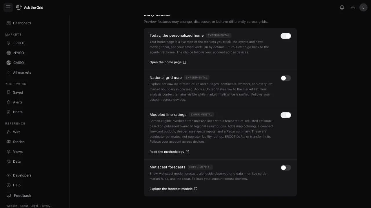
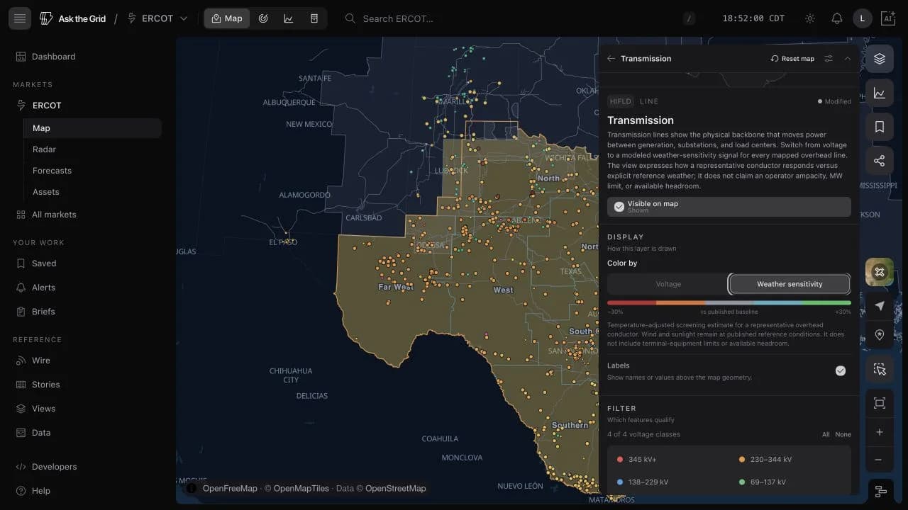
Enable Modeled line ratings in Settings → Advanced. Then open Transmission on any ISO map—or the national map—and switch Color by to Weather sensitivity. Eligible overhead AC lines are colored by the modeled change in conductor current from a published owner or regional baseline. The shared timeline replays historical weather and continues through the available forecast.
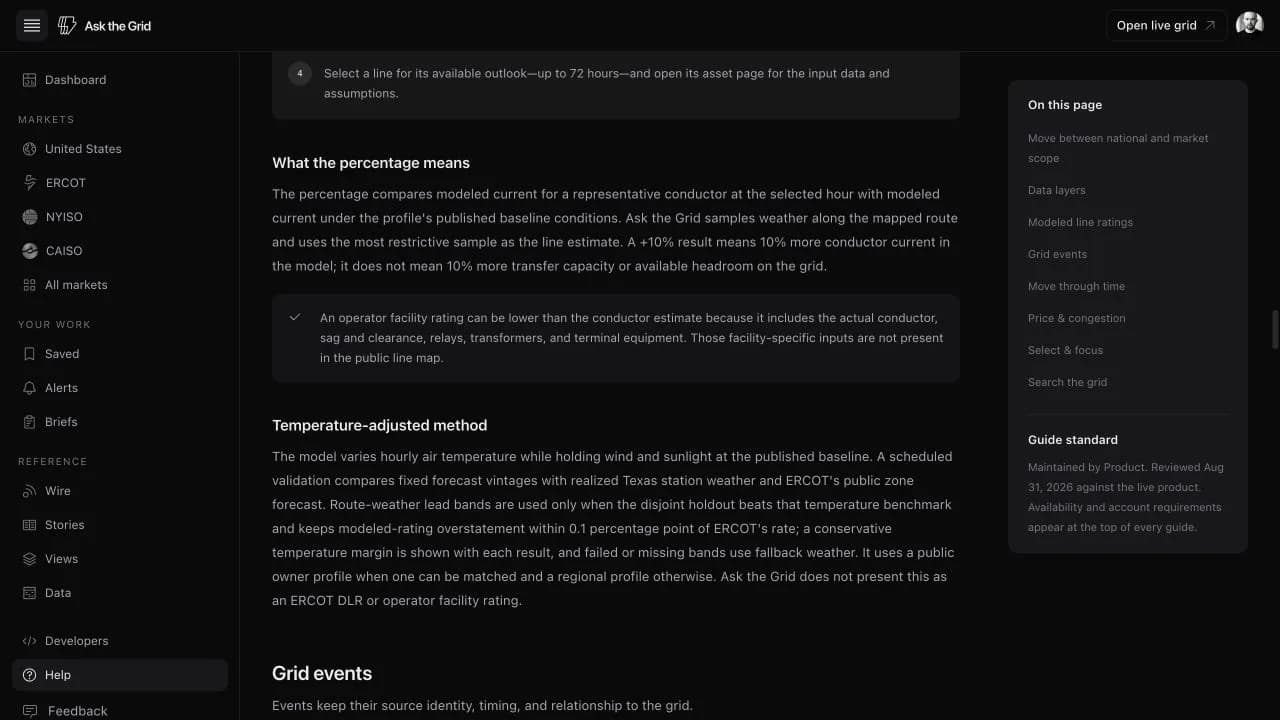
The estimate changes hourly air temperature while holding wind and sunlight at the profile baseline, following the structure ERCOT uses for temperature-adjusted ratings. It stops rising below an equipment floor calibrated against the temperature-rating tables Texas transmission owners submit to ERCOT, because a real facility is limited by its terminal equipment as much as by its conductor, and that equipment does not care how cold the air is. A scheduled validation run compares fixed forecast vintages with realized Texas station weather and ERCOT's public zone forecast. Route-weather lead bands are used only after they beat the ERCOT temperature benchmark and keep modeled-rating overstatement within 0.1 percentage point of ERCOT's rate; failed or missing bands fall back automatically. We deliberately do not expose a full-weather DLR estimate: it still requires a line-matched operator benchmark.
Select a line for a 72-hour outlook and the inputs behind the result. Its asset page shows the limiting route sample, applied air temperature, fixed reference wind and sunlight, published assumption profile, representative conductor, reference conditions, and model version. Radar summarizes the estimates across the market inventory.
These are screening estimates, not operator facility ratings. The equipment floor is a calibrated stand-in for terminal-equipment limits, not a record of any particular facility's equipment; public line geometry still does not include the actual conductor, sag and clearance, relays, or transformers. A modeled increase also does not establish additional transfer capacity or available headroom.
Choose the experiment explicitly
The experiment is off by default and follows the signed-in account across devices. Enabling it reveals the transmission map control, line-card extension, asset-page analysis, and Radar summary together; disabling it removes those surfaces again.
The public changelog and methodology remain readable without opting in, so anyone can understand the release before deciding whether to add the analytical surfaces to their workspace.
Screen every eligible overhead line
Weather sensitivity is available for every voltage class in ERCOT, CAISO, NYISO, PJM, MISO, SPP, and ISO-NE, plus the national map. Underground facilities and DC ties are excluded because the conductor heat-balance model does not describe them.
The map uses the full inventory for modeling while preserving zoom-dependent line visibility, so dense lower-voltage networks do not overwhelm a national or regional view.
Read the selected line without leaving the map
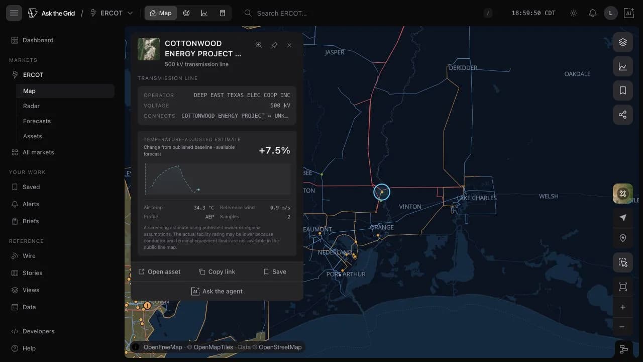
The compact line card shows the selected-hour percentage, the available outlook, air temperature, fixed reference wind, assumption profile, and route sample count. Its copy names the comparison as a screening estimate rather than presenting it as an operator facility rating.
The shared map timeline controls the selected hour, so the card and line colors move together when replaying history or inspecting the forecast edge.
Continue into a durable line record
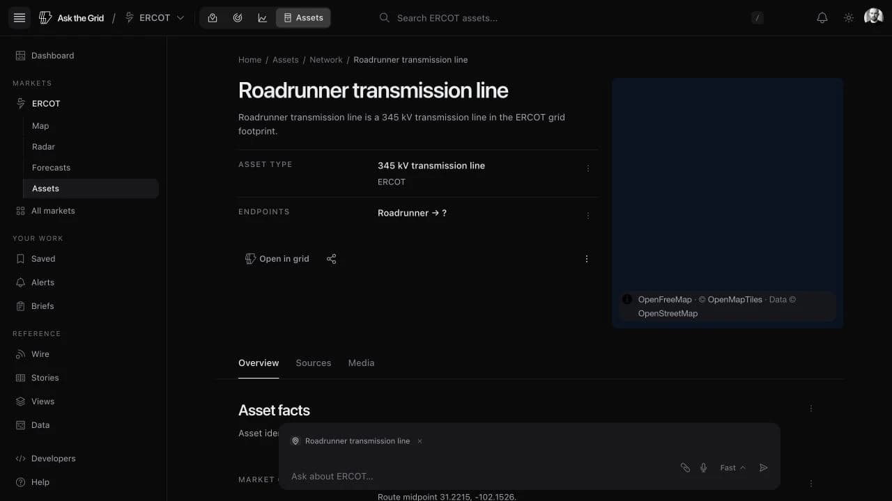
Open asset carries the market identity with the line, avoiding collisions when different ISOs use the same source identifier. The resulting page preserves the mapped route, endpoints, voltage, owner or operator, source record, and a link back to the exact grid selection.
That connection makes the model an extension of the existing asset system, not a separate analytical dead end.
Inspect how the estimate was formed
The deeper asset section explains what the percentage means, how the route samples feed the IEEE 738 heat balance, which sample limits the result, and why the result is not additional transfer capability. Applied and reference inputs sit beside the chart rather than behind an unlabeled model score.
The page also names the published profile, representative voltage and conductor, maximum conductor temperature, model version, and methodology links. Missing public equipment detail remains visible as a real limit on interpretation.
Cold weather stops paying at the equipment floor
A bare conductor keeps gaining capacity as the air cools. A transmission facility does not: its rating is the lesser of the conductor and the terminal equipment at each end, and switches, relays, and current transformers do not become more capable in a cold snap. The temperature-rating tables Texas transmission owners submit to ERCOT show exactly that shape—they gain almost nothing below roughly 65 °F, and about a third are flat across that whole range.
Each assumption profile now carries an equipment floor fitted to those submitted tables, and the modeled estimate stops rising once the air drops past it. Texas owners with enough submitted tables get their own floor; every other profile, in Texas and in the six other markets, uses the pooled Texas fit. A line's asset page names its floor and says whether the floor or the weather set the hour you are looking at.
The practical effect is on cold hours, overnight periods, and winter, where the uncapped conductor calculation is most optimistic and where a reader is most likely to be hunting for headroom. Summer afternoons, when lines are closest to binding, are unchanged.
Move from one line to the market distribution
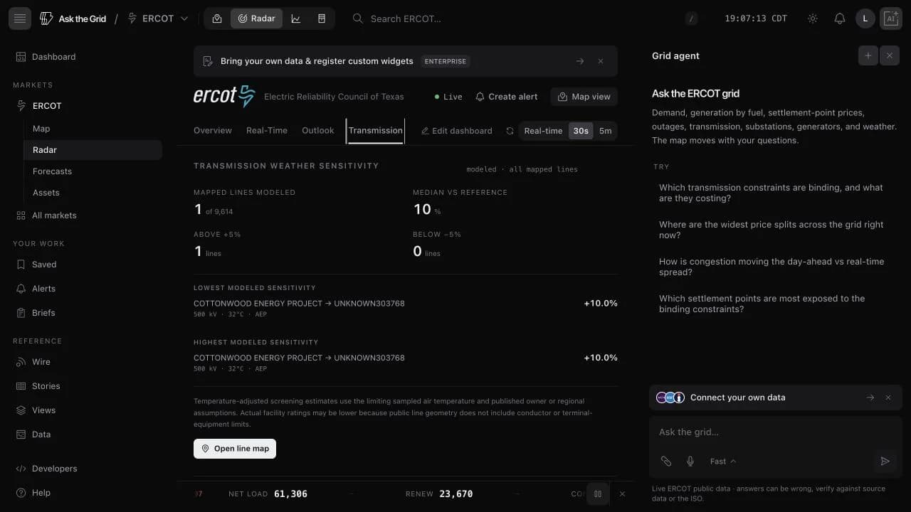
The Transmission desk in Radar summarizes modeled coverage, the median change from reference conditions, both tails, and the lines with the highest and lowest estimated sensitivity. It uses the same materialized hourly output as the map and asset pages.
This market-wide view is intended for screening and investigation: select an outlier, open the line map, then inspect the line record and its assumptions before drawing an operational conclusion.
Net load and every market forecast share one archive
Forty-one load, net-load, price, wind, solar, outage, and temperature forecasts now share one public archive across the organized markets and the Lower 48.
The forecast library brings operator-published outlooks into one comparable product. Each page names the issuer, issue cadence, real horizon, market time zone, source, and uncertainty or coverage limits. Load forecasts retain their zonal detail; price views keep day-ahead and real-time distinct; renewable forecasts are scored against delivered output where settled actuals are available. The archive can be read as a table or card grid and filtered by forecast kind.
The national load page combines total Lower-48 demand from EIA's hourly grid monitor with the day-ahead forecasts reported by regional authorities and a thirteen-region breakdown. It is a national assembly of operator reporting, not a forecast issued by a single grid operator.
Net load pages for ERCOT, CAISO, MISO, ISO-NE, and SPP subtract the published wind and solar forecasts from published demand, then plot all three inputs beside the result so the derived curve can be checked. Outage forecasts add scheduled generating-capacity reductions, and temperature forecasts show the zonal weather operators use when building demand outlooks.
Read the demand the dispatchable fleet must serve
Net load is derived as demand minus wind minus solar from three forecasts each market publishes. The page keeps those inputs visible with the result, rather than asking the reader to trust an unexplained calculated series.
The pages are available for ERCOT, CAISO, MISO, ISO-NE, and SPP. SPP's forecast window runs seven days; the others retain the real horizons of their component feeds. The archive also includes the newly collected outage and zonal-temperature forecast families.
Browse the complete archive by forecast kind
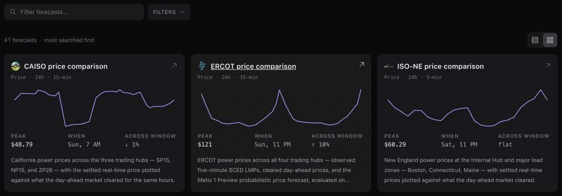
The rebuilt index holds 41 forecast pages across eight kinds. Table and card views use the same list, while filters narrow the archive to the operating question—such as price, load, renewables, outages, temperature, or net load.
Each row summarizes the forecast peak, its hour, and the change across the visible window from the same points drawn in its sparkline.
Open every forecast for one market
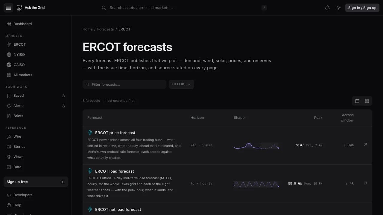
A market's Forecasts tab now opens that market's complete archive at a stable address rather than choosing one page to represent the whole feed set. ERCOT, for example, exposes eight published forecast pages from the same market index.
A national demand view no single operator publishes
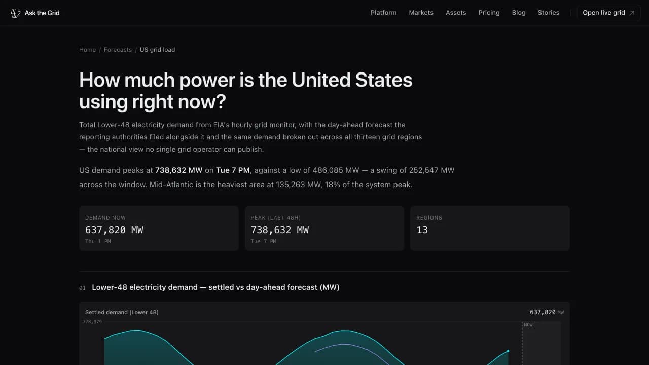
US grid load shows total Lower-48 electricity demand, the filed day-ahead outlook, the same demand divided across thirteen grid regions, and the national fuel mix. The page keeps the source authorities and their reporting boundaries visible rather than presenting the assembly as one operator's forecast.
Comparable pages, operator-native provenance
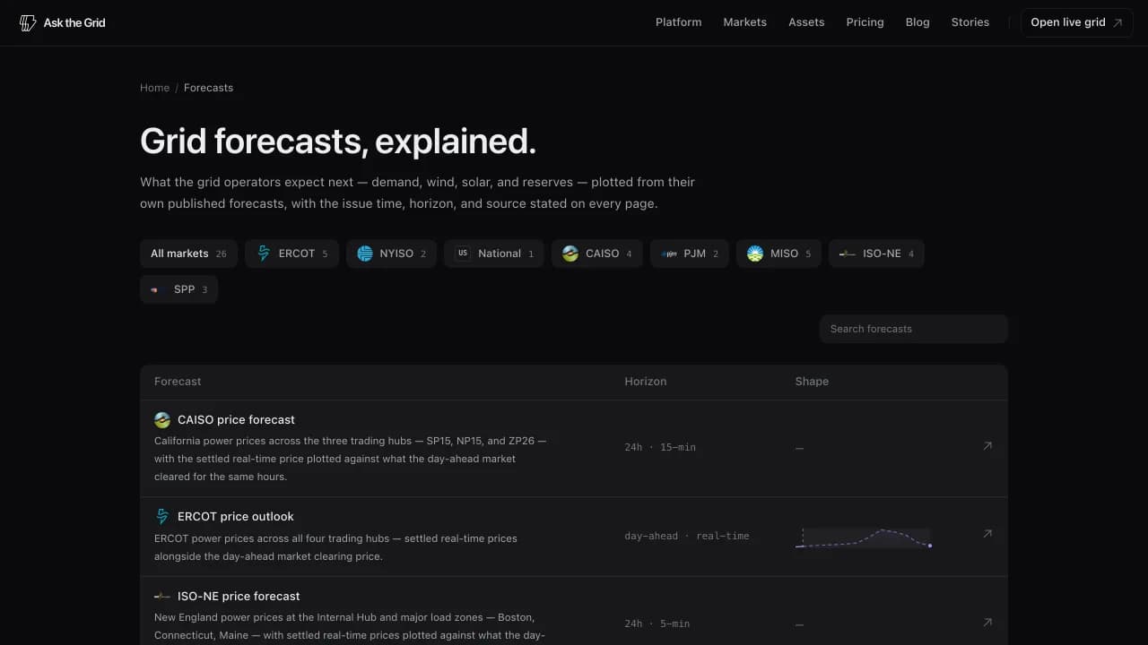
Nineteen forecast pages extend the library across CAISO, PJM, MISO, ISO-NE, and SPP, joining ERCOT and NYISO. A shared page structure makes them easier to compare while operator-specific horizons, cadences, products, and time zones remain explicit.
The directory can be searched or filtered by market and forecast family. Coverage and source links live on the page rather than in a separate methodology note.
Evaluate the vintage that actually existed
Historical comparison preserves the original model run and places the eventual settled values beside it. The evaluation does not blend later information into an earlier forecast, and charts label the boundary between observed history and the live horizon.
Eligible users can also preview Metiscast Energy forecasts on ERCOT node charts, including an uncertainty range, refresh schedule, inputs, methodology, and centrally controlled preview status.
Keep forecast context on the map
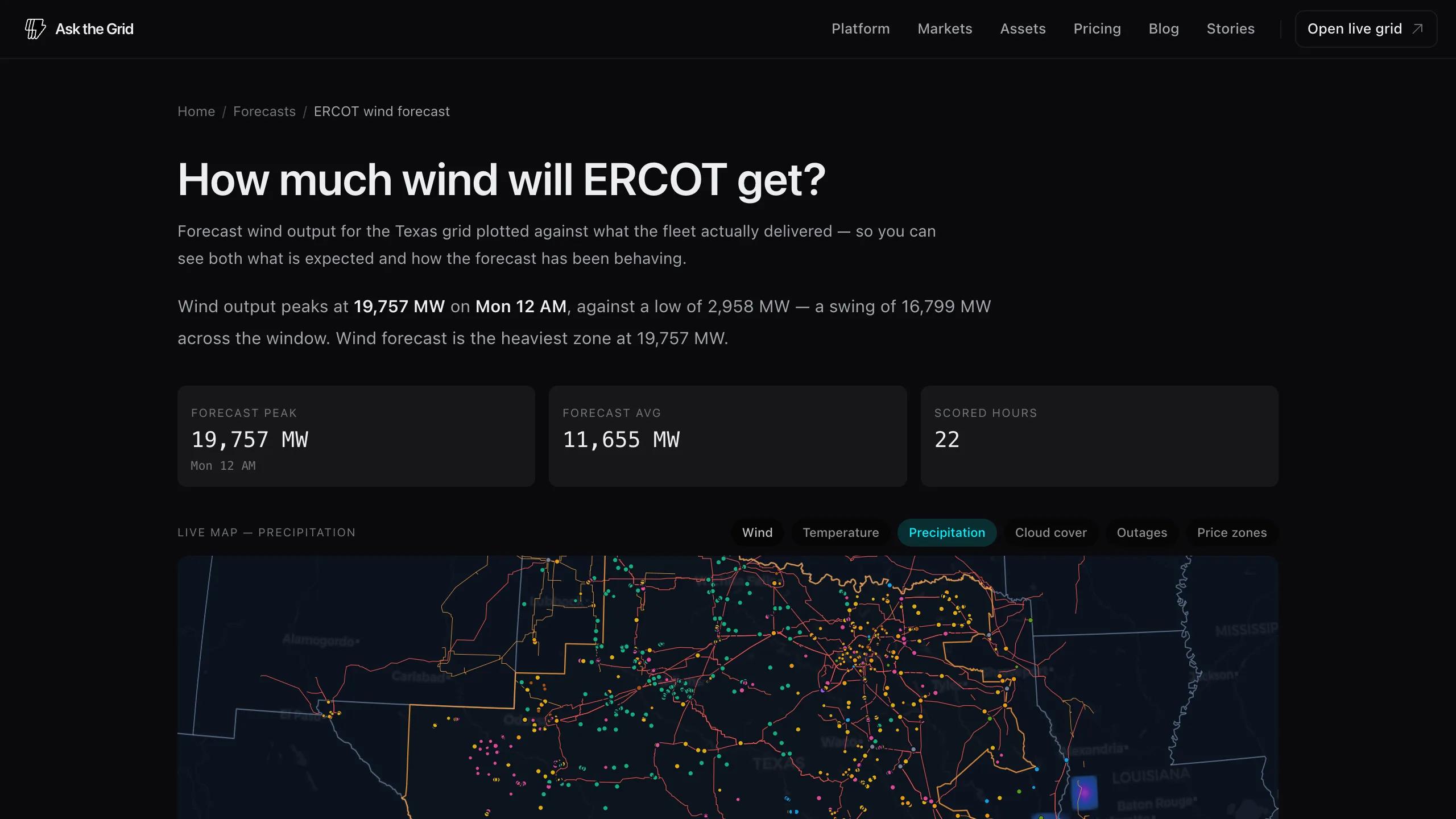
Each curated forecast opens with the map layer that matches its subject. Wind, temperature, precipitation, cloud cover, outages, and price zones can then be combined independently on that page, without altering another tab or the full map workspace.
The source-backed developer platform enters preview
Source-backed answers, MCP connections, Forecast and Data APIs, an interactive console, and scheduled reports make the same grid research system usable in the product or from code.
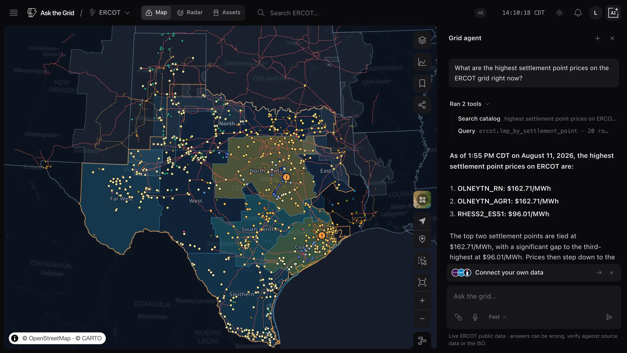
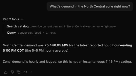
The grid agent is built around a checkable path from question to claim to source. Answers cite the datasets and public reports used, execution rows name the searches and queries that ran, and a selected passage can become a focused request to explain, show data, or chart the claim.
The same evidence model extends beyond the native interface. OAuth-connected MCP clients can search the catalog, inspect schemas, run bounded read-only queries, search assets, read live status, and retrieve published profiles. The developer console adds generated OpenAPI documentation, request history, and interactive Forecast, Data, Insights, Chat, and Alerts playgrounds for signed-in accounts. API keys for external integrations are issued by application. Explicit market scope remains enforced by the service, while account-level saved work stays global to the signed-in user.
See what the agent actually ran
The trace reads as actions and subjects: which table a query read, how many rows came back, which search terms ran, or which file opened. An elapsed clock and current step make longer investigations legible while they are running.
Selecting a passage in the answer creates a follow-up around that exact claim instead of asking the user to restate the surrounding context.
Keep claims tied to sources and market scope
Citations connect an answer to the exact public report or catalog dataset behind it. If the required evidence is unavailable, cannot be aligned in time or units, or falls outside the active market, the agent says so instead of silently mixing grids or filling the gap.
Multi-step questions have room to recover from a failed lookup and continue, while broad investigations stop with a clear boundary when the available evidence is insufficient.
Try the APIs before writing code
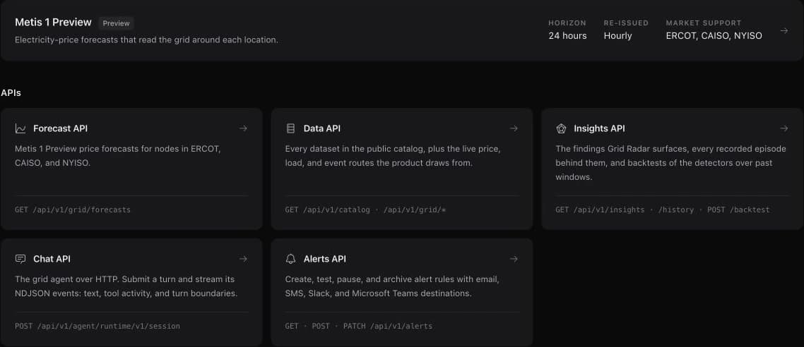
The developer console provides API-key management, request and usage history, generated reference documentation, and playgrounds that show the same response as a chart, table, raw JSON, and copyable cURL, Python, JavaScript, or PHP request.
Forecast returns probabilistic price paths with their model and issue metadata. Data exposes the source-aware catalog and live grid routes. Insights returns findings, recorded episode history, and historical detector evaluations. Chat exposes the grid agent, while Alerts manages monitoring rules and delivery destinations. The reference is generated from the API contracts; playgrounds use the signed-in session, and external integrations use separately approved API keys.
Use the same catalog from another AI client
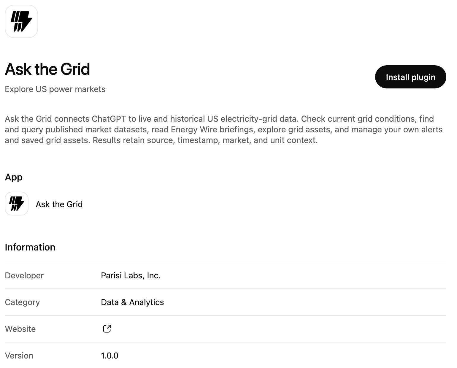
Ask the Grid is in ChatGPT's plugin directory: search for it on the Plugins page, install it, and sign in with your account. Claude, Cursor, Codex, and other compatible clients connect through OAuth 2.1 with PKCE using a market endpoint or the global resource, which expose typed, bounded tools without copied API keys.
Connected clients can also retrieve saved assets and portfolios, search the library, and manage membership through scoped actions and the client's confirmation boundary.
Turn a useful investigation into a repeatable brief
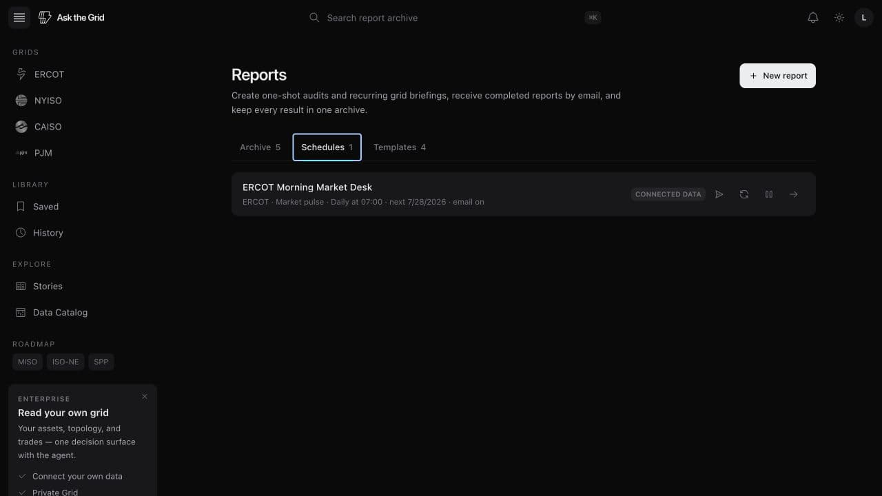
Reports can run once or on a recurring schedule, deliver completed work by email, and keep every issue together. The first public assessment applies that workflow to an operating ERCOT battery, with reconstructed gross value, dispatch benchmarks, peer context, sources, assumptions, and limits kept in the report.
Today and the Energy Wire make the live grid readable
A new daily operating view ranks material conditions across all seven markets, while the Energy Wire keeps the reporting behind those conditions organized by grid.
Ask the Grid now has a front door for the current operating picture. Today puts a live congestion map beside ranked findings across ERCOT, CAISO, NYISO, PJM, MISO, ISO-NE, and SPP. The Energy Wire follows the reporting, filings, and market news around that picture, with permanent market pages for work that starts inside one grid.
The two surfaces are connected but not interchangeable. Today is built from observed grid signals and routes each finding into its supporting map or Radar desk. The Wire preserves the publication and original source for reported developments. Together they provide a concise place to begin without collapsing observations, forecasts, and reporting into one kind of evidence.
Start with the strongest current conditions
Today distinguishes binding constraints, price separation, forecast misses, operating margins, frequency, and operator conditions without filling the page with routine readings. Every finding carries its market, source status, observation time, and a route to the relevant Radar desk or map.
Each operator keeps its own publication cadence and terminology. Unsupported, quiet, stale, and unavailable signals remain distinct, so an empty reading is not rewritten as a normal one.
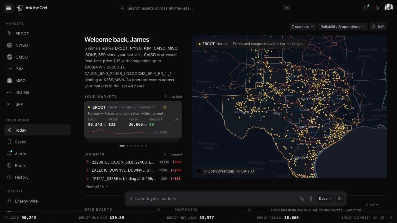
Inspect the comparison and follow the episode
A finding's What was compared chart preserves the observations and comparison series used when it was evaluated. Constraint materiality includes the duration, recent binding history, and supported hub or zone price evidence; the market's penalty-price rule alone does not make every occurrence critical.
Follow this finding subscribes to its activation and resolution. The Insights API distinguishes recorded episode history from replay: Recorded summarizes the episodes the system retained, while Replay runs the current detectors over past data available at each evaluation time. Those are different questions, and the console keeps the mode explicit.
Arrange the home page around the markets you follow
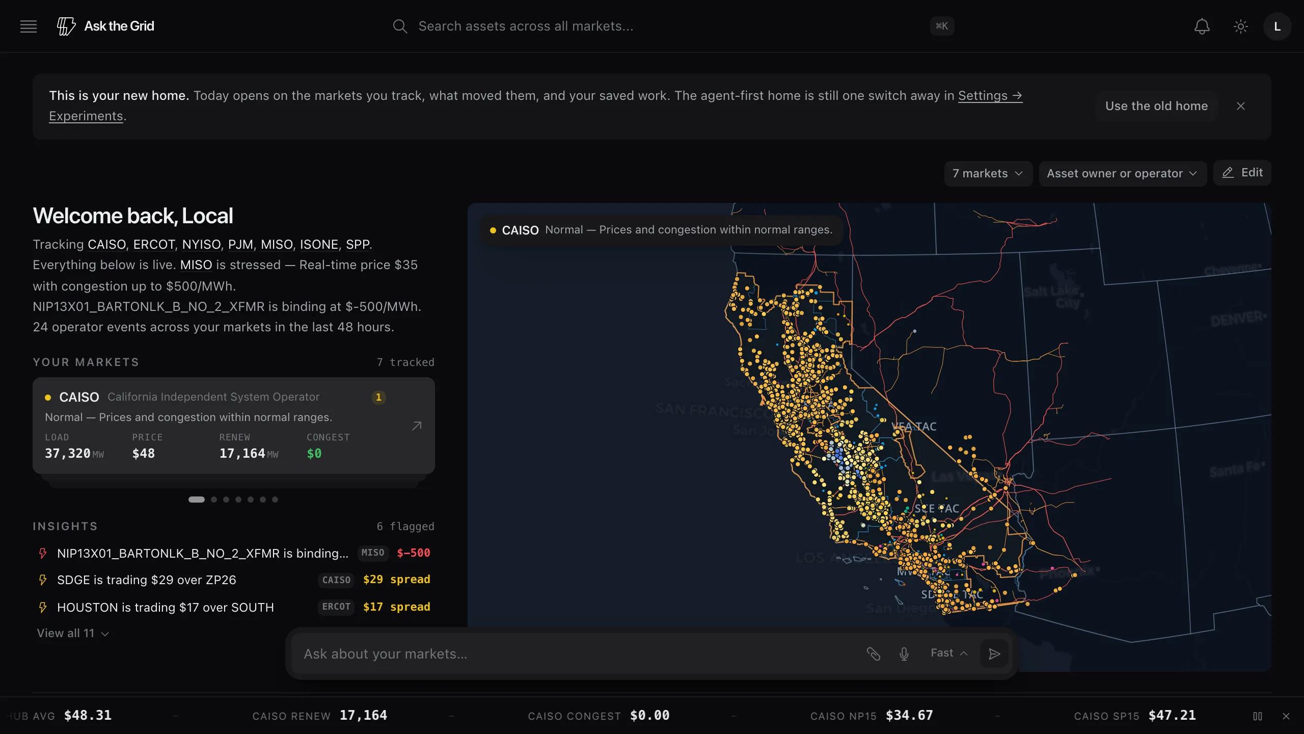
Signed-in users can choose tracked markets, move or hide modules, and keep saved views and briefings close to the live picture. The agent remains available from the page without replacing the operating overview.
The layout is remembered in the browser. Users who prefer the agent-first landing can change the home experience in Settings rather than losing access to either surface.
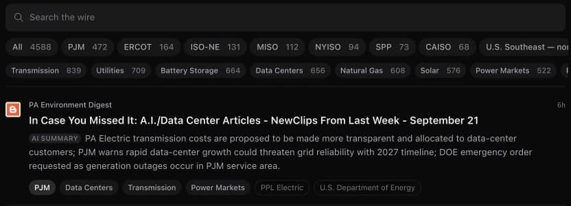
Follow the reporting without losing its source
Energy Wire brings power-sector coverage into a searchable feed that can be narrowed by market and sector. Each item names its publisher and links to the original reporting; the Briefing Desk summarizes the corpus without replacing those links.
Grid-specific routes such as /wire/pjm and /wire/ercot keep a market's headline, story list, URL, and agent context aligned. The main Wire remains the national and global view.
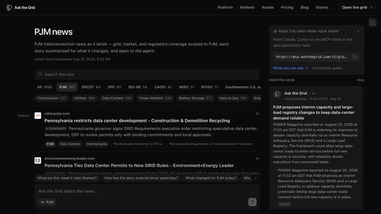
Return to the same market view
A market page is a stable place to bookmark, share, or continue an investigation. Moving between markets updates the address and the agent scope together, avoiding a filtered page whose URL says something else.
Stories also support a publication-wide email subscription from the end of an article, with confirmation returning the reader to the same story and notification controls remaining available afterward.
One data vocabulary spans the live markets
Comparable market tables, natural-gas fundamentals, and current weather now sit in one query-ready catalog with explicit units, provenance, revision handling, and coverage.
Cross-market research used to begin with translation: different location keys, component signs, column names, revision rules, and time conventions for the same market concept. Thirty-eight canonical datasets now give real-time and day-ahead prices, load, generation mix, ancillary prices, and binding constraints a shared shape across ERCOT, CAISO, NYISO, PJM, and SPP.
The catalog also reaches beyond market outcomes to two of their principal drivers. Natural-gas datasets cover delivered regional fuel prices, Henry Hub, and interstate pipeline capacity and schedules. Current and forecast weather adds hourly temperature, wind, cloud, radiation, and precipitation through the near-term horizon while remaining separate from delayed historical reanalysis.
Ask one cross-market question
The canonical tables use the same names and units for common concepts while retaining each market's native locations and published components. Price-location dimensions resolve operator names and types, and source revisions are collapsed so a restated interval is not counted twice.
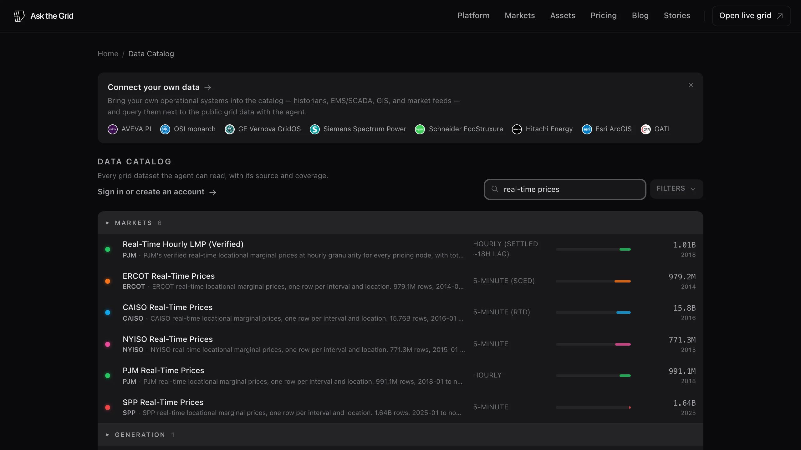
Coverage varies by feed and remains visible. ERCOT generation mix reaches back to 2007, ERCOT and NYISO prices to 2014 and 2015, and CAISO prices to 2016; thinner datasets say so instead of implying equal history.
Put fuel cost beside power prices
CAISO's daily fuel-region series covers 201 delivered-cost regions, including Waha, back to 2015. EIA's Henry Hub spot series reaches January 1997. FERC pipeline postings add design, operating, available, and scheduled quantities at metering points on 34 interstate pipelines.
The distinctions matter: the CAISO values are a gas index plus transport adder, not hub settlement prices, and pipeline schedules are physical postings rather than proof of a causal relationship with a power-market move.
Separate current weather from historical reanalysis
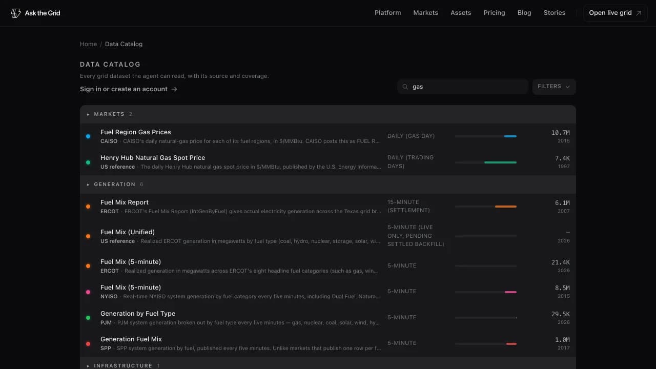
The hourly forecast grid covers temperature, humidity, wind at several heights, cloud cover, solar radiation, precipitation, and other grid-relevant conditions through the next two days. Historical ERA5 remains available for backward-looking work, with its delayed status shown separately.
Views, Saved, and embeds turn grid work into a workspace
Curated live views now cover all seven markets, while Saved, portfolios, bulk asset imports, and live embeds preserve the exact work worth returning to or sharing.
Ask the Grid now supports the full path from a market index or reviewed starting point to a reusable personal workspace. Each market page gathers its live Views, forecasts, Wire coverage, reports, stories, source datasets, and MCP server. Views then frame specific operating and planning questions with a live table, explanation, sources, and an Open in Map handoff. Saved keeps useful map states, assets, stories, and answers together; portfolios organize asset watchlists without duplicating them.
The same work can leave the product without becoming stale. A configurable embed carries a live or time-fixed grid view into another page, and stable links reopen the underlying map context. The Help Center documents the controls and source boundaries for people who need to reproduce the workflow.
Begin from a market index or reviewed live View
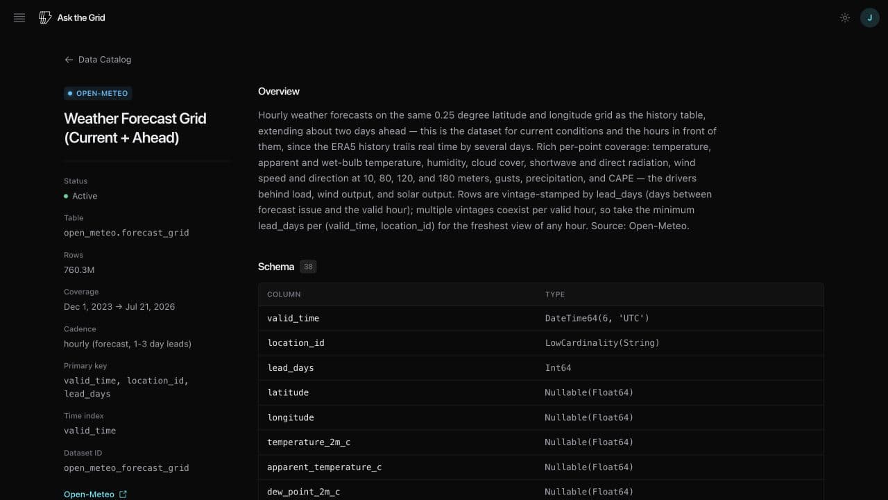
Every market has a permanent index of what is live on that grid. Views now cover interconnection queues and real-time LMPs across all seven organized markets, grouped by the operating question. Each one keeps a focused configuration, plain-English context, sources, and a handoff into the exact interactive map state.
The collection grew from ERCOT, NYISO, CAISO, and PJM to include MISO, SPP, and ISO-NE, with operator-native statuses and publication dates preserved.
Keep the work you will use again
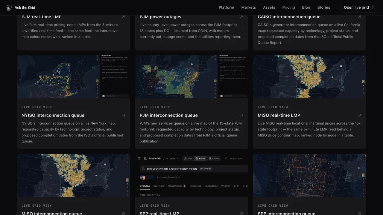
Saved provides one library for watchlisted assets, map views, stories, and answers across devices. Filters separate kinds of work without turning them into disconnected products.
Named portfolios add a second organization layer to asset watchlists. One plant can belong to several portfolios, and removing a portfolio does not unsave its assets.
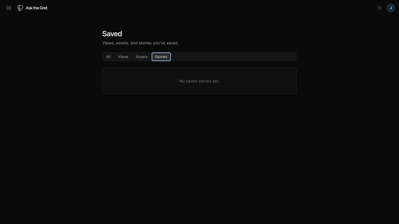
Bring in an existing asset list
Bulk add accepts pasted EIA plant IDs or a CSV, resolves each ID to a named plant, and shows fuel, capacity, existing watchlist status, and unsupported grid coverage before saving. A full import can be filed into a portfolio in the same step.
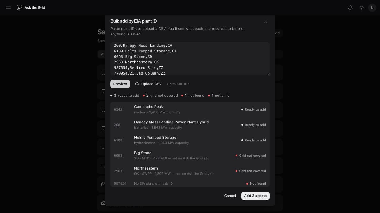
Share a view that stays live
The embed builder preserves market, layers, framing, and either live time or a selected timestamp. It previews the composition before producing code for an article, operating note, dashboard, or internal workspace.
Permanent view links and the searchable Help Center provide the same reproducible route for people who need the full interactive controls.
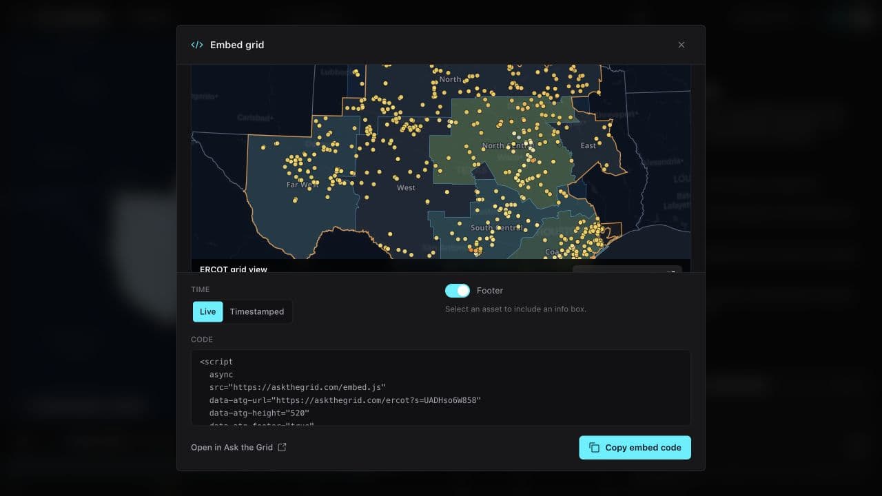
Seven live markets become one national grid map
ERCOT, CAISO, NYISO, PJM, SPP, MISO, and ISO-NE now share one map vocabulary, national infrastructure and weather layers, market-native detail, and a common timeline.
Ask the Grid's map grew market by market—from ERCOT to New York, PJM, SPP, MISO, and finally ISO New England—until every organized US power market had its own live geographic workspace. The national map is the second step: it shows those seven footprints together and resolves equivalent operator concepts into one discoverable layer system.
The unification does not erase market boundaries. Operator-native names, source links, settlement locations, constraints, and publication cadences remain attached to each layer. Physical generation, transmission, substations, customer outages, and continental weather extend beyond ISO borders where national sources support them.
One national layer vocabulary
Zones, load zones, TAC demand areas, and local resource zones resolve to Zones. LMP nodes, LBMP nodes, PNodes, and settlement points resolve to Price nodes. The common controls reduce navigation cost while each detail view retains its operator terminology and source.
EIA-860 generation and HIFLD transmission and substations render nationally, ODIN customer outages render from its county feed, and temperature, precipitation, cloud, wind, and GOES lightning use their continental footprints. Exact ISO boundaries remain visible as the operating-market context.
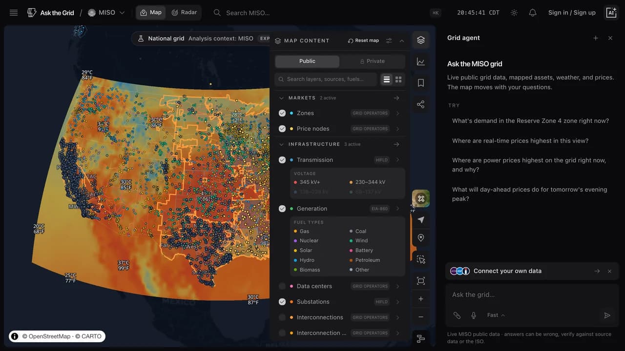
Beyond ISO footprints: Bonneville and the ties between grids
The workspace now includes Bonneville's balancing area alongside the seven organized markets. BPA keeps its own hydro-system Radar and map evidence; the prices at its WEIM locations are published by CAISO. A balancing area is not presented as an eighth ISO market.
Interfaces keeps each price-bearing location attached to the operator that publishes it. Supported tie-flow arrows show the direction of power movement and use published limits where available. BPA's Regional transmission layer can color transfer-cut lines by loading, preserving the distinction between an operator's reported interface and a mapped physical line.
The central and Great Plains markets join
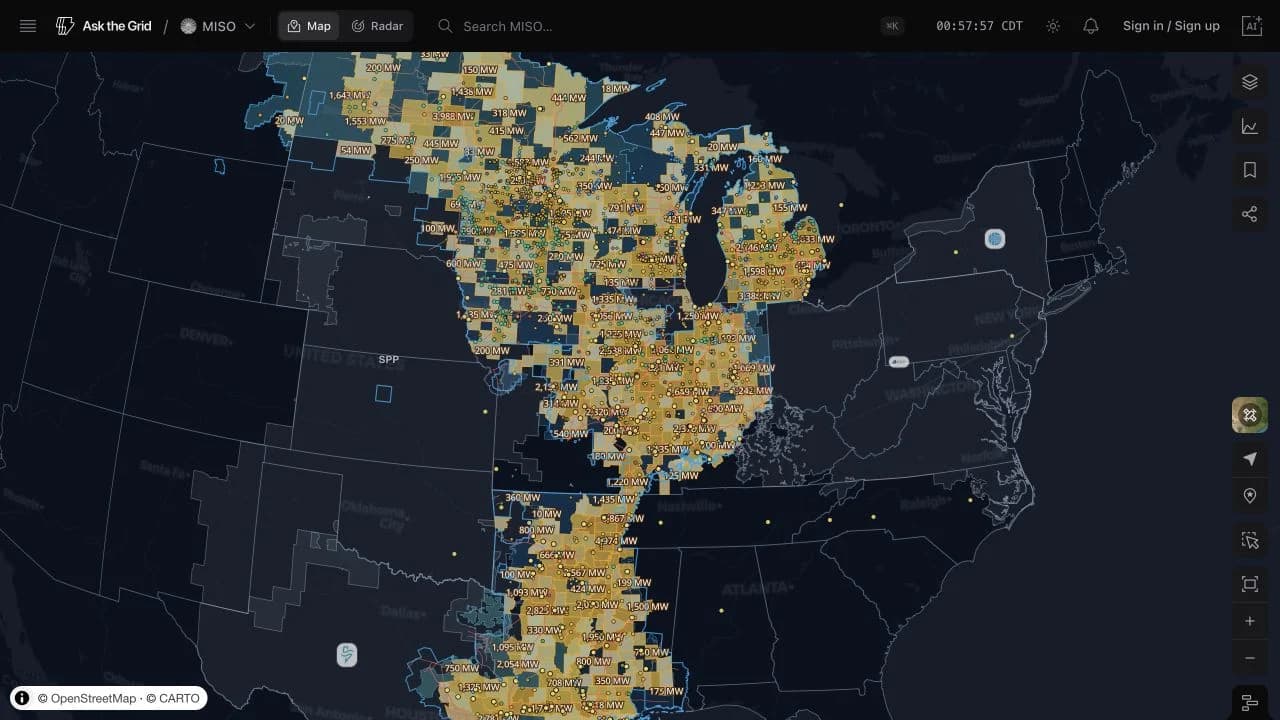
MISO added its operator footprint, local resource zones, geolocated settlement points, generation, transmission, substations, weather, and interconnection queue. SPP added its own public geography, live prices, load, fuel mix, renewable forecasts, ancillary clears, and binding constraints.
The product omits signals a market does not publish in a compatible form rather than copying another operator's widgets into an empty shell.
ISO New England completes the seven-market map
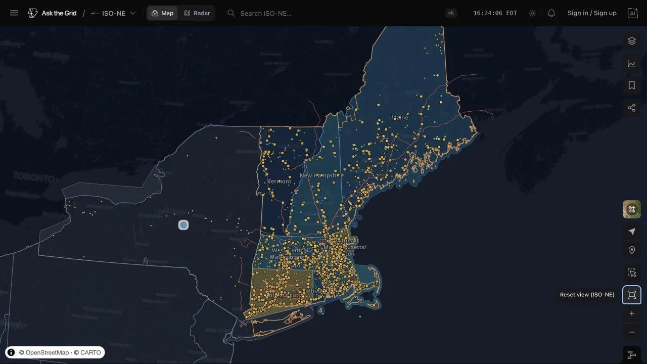
ISO-NE added the Internal Hub, eight load zones, 1,137 active physical PNodes, generation, transmission, substations, utility territories, its interconnection queue, and nationwide weather overlays across six states.
Its Radar and dedicated agent scope follow the same rule as the map: only signals backed by compatible New England feeds appear.
Market launches remain operator-specific
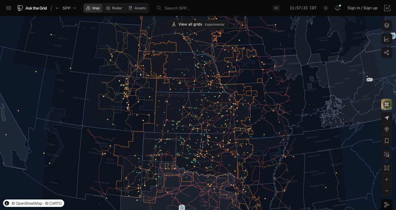
PJM and NYISO established the multi-market map before the national view. SPP then brought the same navigation model to the Great Plains without treating its feed set as a generic copy of another ISO.
Neighboring markets remain visible as quiet geographic regions, so moving between grids is a map action while the selected market keeps the explicit agent and analysis boundary.
A common timeline connects the layers
The map timeline opens beneath the workspace, steps by day, and can compare several series across the same window. Sunrise and sunset markers support solar context, while the available forecast edge extends the view beyond the latest observation without presenting forecast data as settled history.

All seven interconnection queues share one map
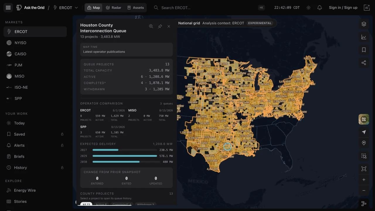
Official queue publications from ERCOT, CAISO, ISO-NE, MISO, NYISO, PJM, and SPP can be compared nationally, then opened as operator-specific county and project records.
The Interconnection queue layer combines every supported organized market without collapsing their sources or native records. County capacity, project counts, technologies, and normalized active, completed, and withdrawn statuses provide a national comparison; publication dates, operator names, queue IDs, and project histories remain market-specific.
Coverage is the seven organized US markets supported by Ask the Grid. Areas outside those footprints—including much of the Southeast and Arizona—require additional utility or balancing-authority sources before they can appear. Requested queue capacity is not a forecast of what will be built, and an operator status is not independent proof of commercial operation.
Compare the official queues nationally
The national layer shades counties by requested capacity and keeps counties shared by several market footprints intact. Opening one compares publication date, project count, active capacity, and total requested capacity for each operator side by side.
Project rows retain their native market and queue ID, so the next step always opens the correct operator record.
Replay the publication that existed at the time
ERCOT's detailed workflow follows map time: move backward to the queue publication available then, between adjacent snapshots, or forward to active projects whose proposed completion date falls inside a chosen horizon. County totals keep that meaning beside the result.
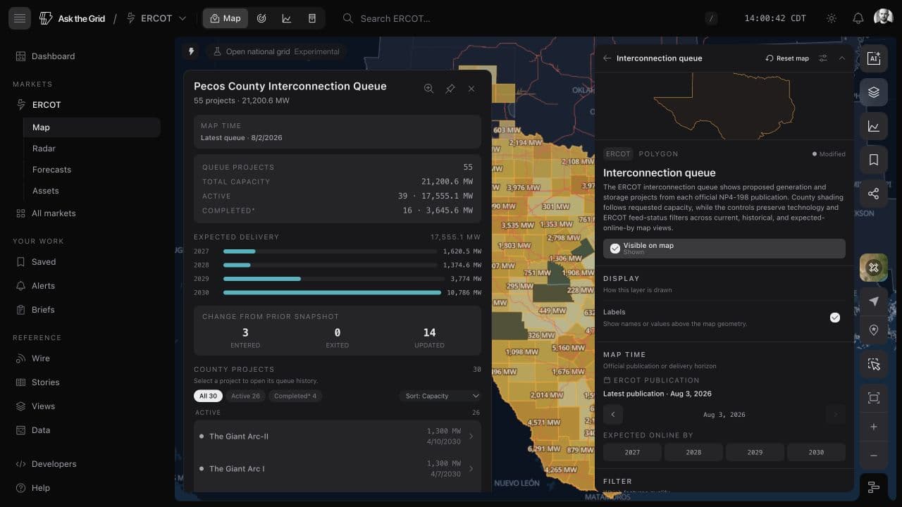
Inspect the native project history
Individual records preserve queue ID, developer, requested MW, technology, point of interconnection, status, proposed dates, and changes across official publications. County-centroid placement remains explicit because the source does not publish exact project geometry.
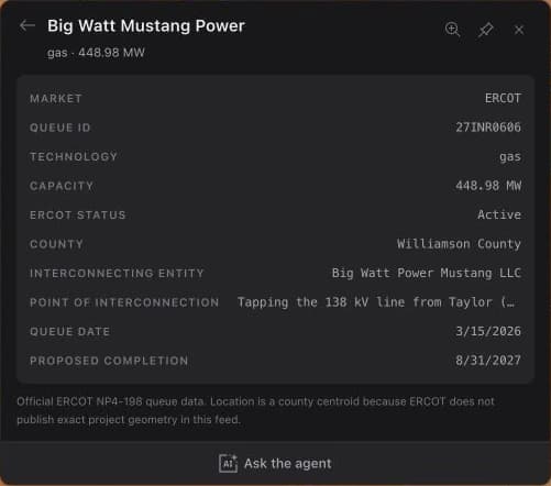
July
2026
Grid assets become explorable operating records
Source-backed plant profiles, generation detail, independently mapped data centers, and New York hosting capacity connect individual facilities to the public grid evidence around them.
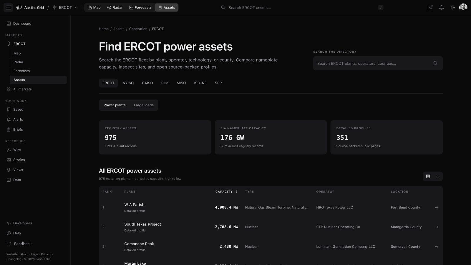
Asset research now moves from the fleet to the facility and back to the grid. Asset directories span ERCOT, CAISO, NYISO, PJM, MISO, ISO-NE, and SPP, with the market switcher preserving the Assets view between grids. Each directory searches plants by operator, technology, county, and market context; individual profiles collect operating records, generation history where available, related parties, and linked primary sources.
The map adds other infrastructure questions that are not represented by a conventional generator record. Publicly mapped data centers can be studied beside transmission, substations, prices, weather, and queues in ERCOT. NYSERDA's county hosting-capacity rollup shows where New York distribution systems report headroom, including separate ESS charging and discharging views.
Search the fleet, then open the public record
Profiles join plant and equipment records with generation history where available, market context, related parties, and primary-source links. Every organized US market has the same Assets entry in its workspace header, while market views and technology leaderboards provide a way into the directory without requiring an exact plant name.
Read an individual plant's disclosed output
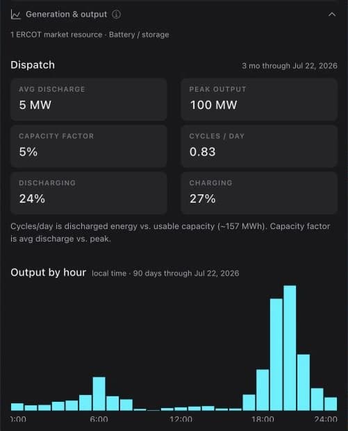
Selecting a plant opens current or recent operating detail and a generation history drawn from the available public feed. Storage plants show dispatch; other plants show output by fuel. The catalog states the cadence and coverage behind each view.
ERCOT plants read ERCOT's own disclosed telemetry: twelve months of output, and for the latest disclosed day how each resource traded at its settlement point's real-time price. A battery shows what it discharged and charged at, the spread between them, and the reserves it held. Plants in other markets report monthly generation from EIA-923 filings.
Place large loads in grid context
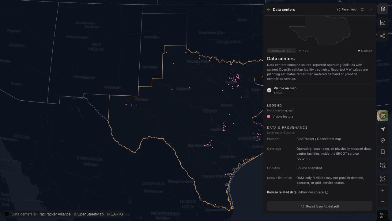
The ERCOT data-center layer uses OpenStreetMap for facility location and footprint, with a separate reviewed publication process for ownership, development, power, permitting, compute use, environmental context, and local reporting.
Published MW values retain whether they are requested, contracted, energized, gross campus, or critical IT load. They are not presented as metered demand.
Separate battery charging and discharging headroom
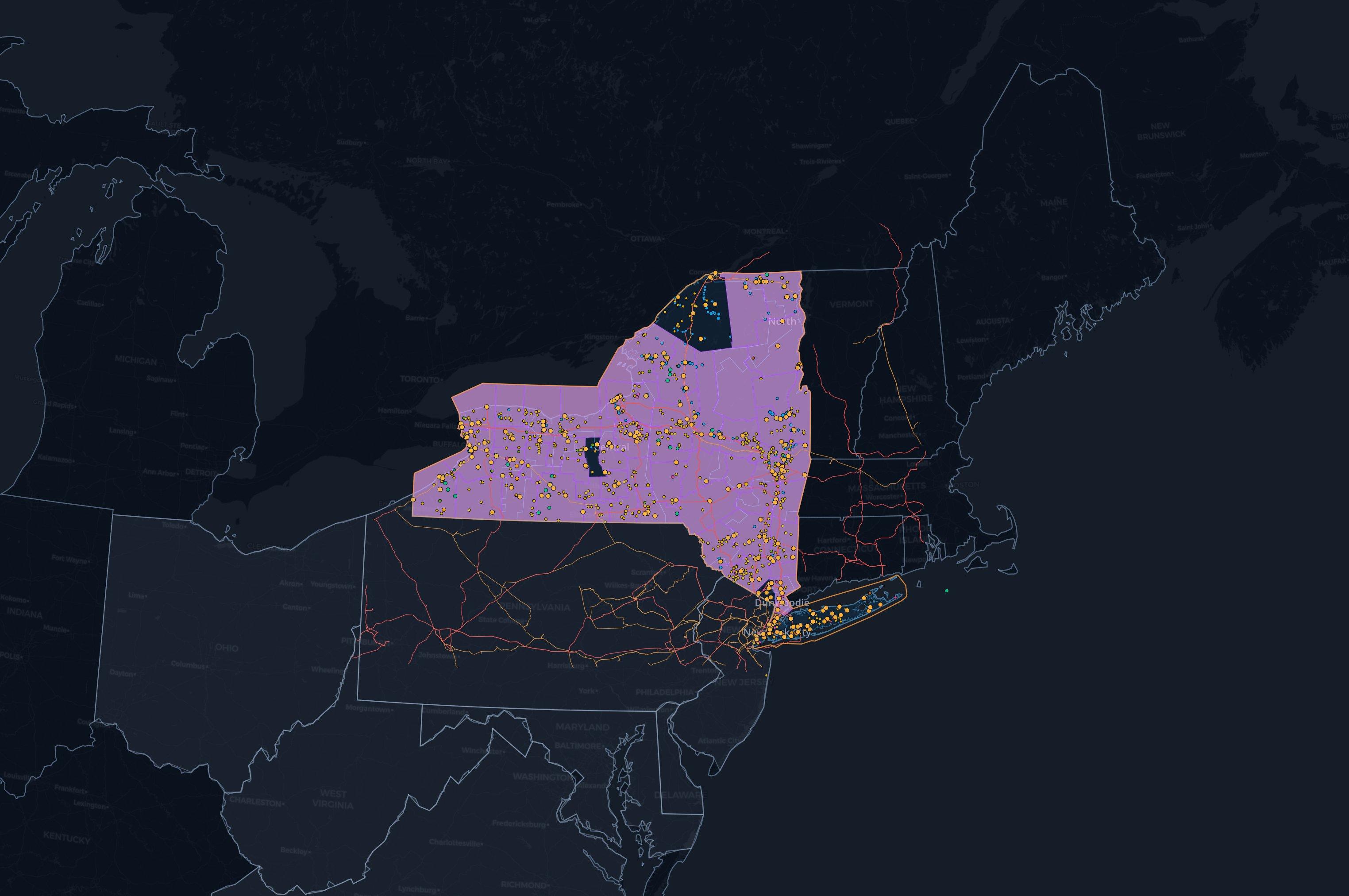
NYSERDA's IEDR rollup covers all 62 New York counties with DER counts, feeder counts, and hosting-capacity headroom. Total, ESS charge, and ESS discharge views expose the directional asymmetry that a single total can hide.
The source refreshes daily and supplies statewide coverage including National Grid and PSEG Long Island, whose own public layers do not provide the same statewide view.
Radar, events, and alerts turn live data into an operating desk
Market-native Radar desks now connect live prices, demand, congestion, generation, operator events, and persistent alerts without inventing signals an operator does not publish.
Grid Radar began as a dense ERCOT operations cockpit and expanded into market-native desks for CAISO, NYISO, SPP, MISO, and ISO-NE. Each version follows the same operating questions—condition, supply and demand, prices, congestion, resources, weather, and events—while showing only the measures its operator actually reports in a compatible form.
Events and alerts turn the cockpit into an ongoing workflow. Normalized operator notices, outages, schedules, and observations remain distinct on the map, Radar, asset pages, and in the agent. A contextual alert can then keep evaluating a value, event stream, asset, or geographic scope after the dashboard closes.
A market-native operations cockpit
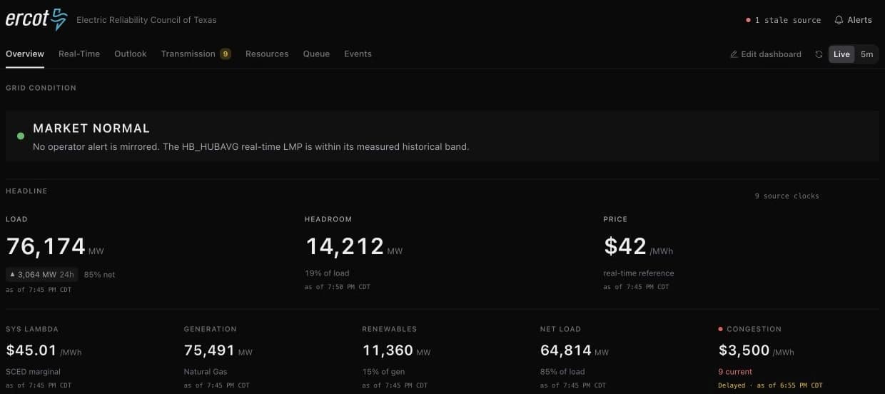
ERCOT Radar combines load, headroom, hub price, system lambda, net load, congestion, committed capacity, fuel mix, constraints, border prices, and real-time versus day-ahead basis. CAISO and NYISO added their own supply, demand, prices, constraints, renewable, storage, interface, and operator-event views according to their published feeds.
Widgets show an explicit empty state when a live source is unavailable. Custom layouts persist, individual widgets have stable links, and image export supports briefings without changing the data shown.
Expand without pretending every grid is the same
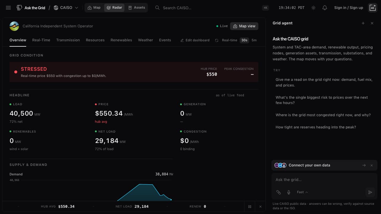
CAISO includes intertie and nomogram congestion, battery dispatch, and wind and solar actual versus forecast. NYISO includes generation by fuel, eleven load-zone prices, external-interface prices, and operator advisories. Where one market has no compatible counterpart to another's measure, the desk leaves it out.
Move from a headline price to the geographic signal
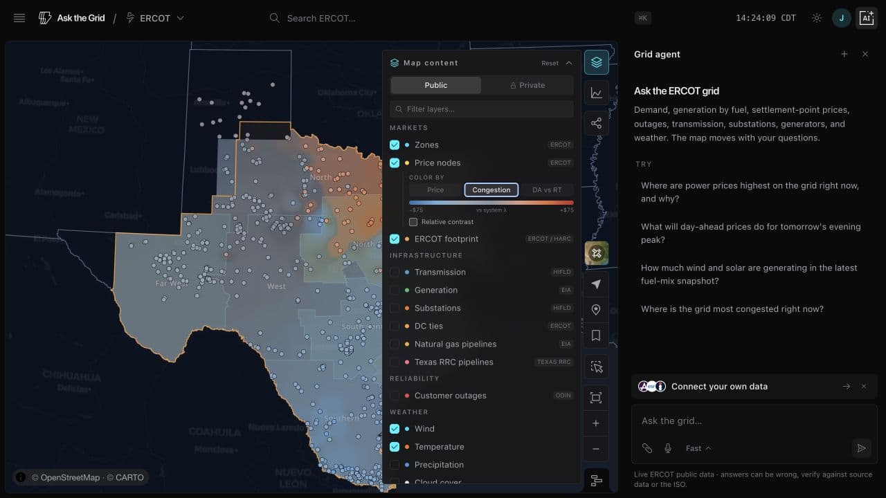
ERCOT price nodes can be colored by congestion relative to system lambda or by real-time versus day-ahead congestion difference. Replaying the timeline shows how separation moves across the day.
This is an observational view of public settlement data, not a power-flow model or proof that a particular constraint caused every local price move.
Keep operator events distinct and source-backed
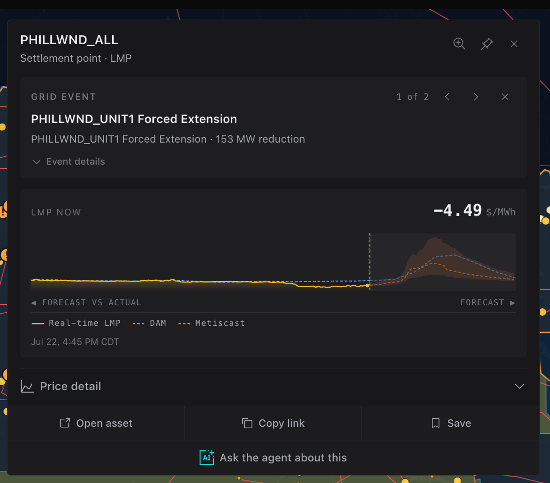
Operational episodes, schedules, and grid-level observations retain provider, publication or observation time, valid window, severity, status, and geographic or asset attachment. Repeated intervals remain one episode, and an aggregate outage snapshot is not counted as a second physical event.
ERCOT planned, forced, dispatchable, and renewable outage quantities remain separate. A grid-level publication does not pretend to identify a resource, and temporal overlap is not presented as causation.
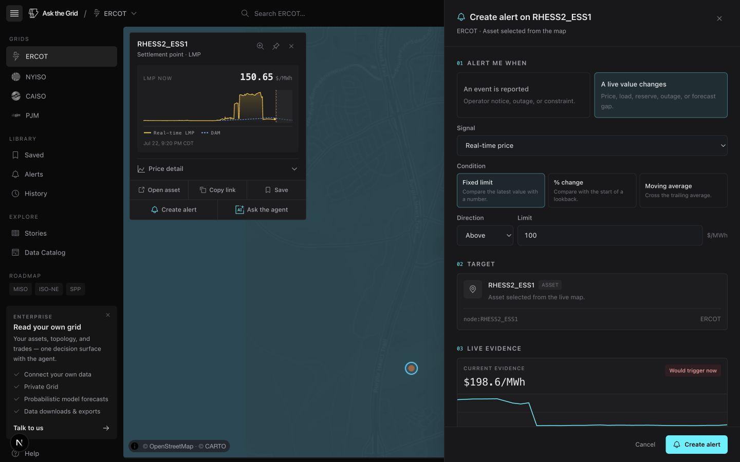
Turn the observed condition into a persistent alert
Alerts can begin from a selected node, Radar metric, asset, multi-selection, area, or dropped pin. The composer carries the active grid, entity, geometry, metric, and starting value into the rule while keeping the underlying workspace visible.
Rules can require repeated evidence before activating, use recovery bands, track source health separately from the monitored condition, and keep an evidence history. The manager supports testing, editing, cloning in a paused state, pausing, resuming, and archiving.