Map, layers & timeline
Move between the national grid and one market, combine source-labeled layers, replay time, inspect congestion, and focus the exact assets that matter.
Open the ERCOT map- Status
- Live
- Access
- Free account · Shared links viewable without sign-in
- Reading time
- 13 minutes
- Reviewed
- Oct 1, 2026
- Maintained by
- Product
The map is the geographic spine of Ask the Grid. It connects 9 supported grids—the seven organized US power markets and the Bonneville balancing area—through one discoverable vocabulary while preserving the operator, market surface, timestamp, and source behind each layer. National infrastructure and weather can cross market borders; prices, constraints, and operator events remain attached to the market that published them.
Every time-aware layer follows one shared playhead. That makes the map more than a current-state picture: move backward to reconstruct an interval, forward into the available forecast horizon, or place several series under the same clock before asking the agent to explain what changed. The interactive workspace requires a free account; a persisted map link opens as a public, read-only view so the finding can still travel through a message, document, or story.
On this page
Move between national and market scope
Use the national view for geography and comparison; enter one market when operator semantics or live prices carry the question.
Use national scope deliberately
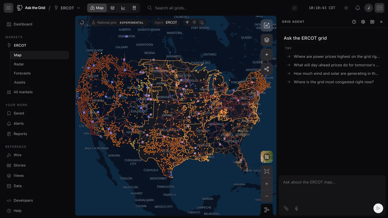
Choose United States in the left navigation or the market menu, or select United States in any market map's top-left corner. The national map draws every live market boundary beside nationwide generation, transmission, substations, interconnection queues, customer outages, and continental weather. Each market's coverage is outlined and named in its own color. The agent answers for the whole country: selecting an asset or a tie makes that asset's market the default for unqualified questions, selecting a market's area does the same without a selection, and a question that names another market reads that market. The control then reads as that market's map, such as CAISO map, and opens it. The national map leads with trading hubs, registered interties, market interfaces, and the high-voltage backbone; turn on price nodes when you want every location. A registered intertie stays selectable when it has no current MW reading. Its card identifies the connected grids and available operator readings; a market interface card can also show our side's price and, where supported, a price spread. Choose Open asset on a registered tie's card for its intertie page: physical identity, source notes, mapped hardware, and operator flow and history where published. The curated directory is at Assets → Interties, including retired profiles that do not appear on the live map. Asset comparisons and Metis price forecasts on nodes stay on a single market's map. Use this scope to compare geography and move between markets, not to average prices or constraints across incompatible market locations.
Enter a market for operator data
Selecting a market updates the URL, active layer availability, operator terminology, map camera, and agent scope together. A market map uses the operator's own layer names, such as LMP nodes on PJM or LBMP nodes on NYISO; the national map groups equivalent layers under one name, such as Zones or Price nodes. The info card always retains the native location type and source.
Data layers
Toggle what the map draws from Map content. Grid holds shared layers; supported maps also show a Utilities tab for utility-published data. Search within either view to find a layer fast.
Markets & infrastructure
Turn on Zones, Price nodes, Trading hubs, Interfaces, Regional transmission, Generation, Data centers, Regional substations, and Interconnection queue. Zones are shaded by each zone's load against the highest load it reaches across the timeline window; switch Demand fill off in the Zones layer to keep only the outlines and names. Generation is color-coded by fuel; Regional transmission is colored by voltage, or on a single-market map by modeled weather sensitivity when the line ratings experiment is on.
Find data centers
Turn on Data centers in Map content to see published sites on ERCOT, CAISO, NYISO, PJM, MISO, ISO-NE, and SPP, or together on the national map. Select a marker to open its card and asset profile. Census street-address geocodes are approximate map points; the profile labels them beside the summary and links to the geocoder in Sources. Where a mapped building footprint exists, the map can show it alongside the site marker. The layer starts off so you can add it when comparing sites and nearby grid infrastructure.
Read BPA's Western market nodes
On the BPA map, turn on WEIM price nodes to see the settlement points in Bonneville's balancing area. CAISO publishes their real-time WEIM prices, so the same points are also in CAISO's Western pricing overlay. Select one for its price chart. Where your account can read Metis 1 Preview at that node, the chart and Price forecast section use the CAISO model run. Forecast volatility colors the width of the model's P10–P90 price band at the selected future time, clipped to BPA's footprint. This forecasts WEIM real-time prices; BPA does not operate a day-ahead market on this map.
Follow market seams across routes
Interfaces is one national layer available on every ISO map. It includes price-bearing interfaces published by MISO, PJM, SPP, and ERCOT; the route's market is emphasized and the other markets remain quieter context. Registered, non-retired intertie profiles also have stable markers where a sourced or representative position is available, even when the operator has no current flow reading. Select a profile marker to inspect the connection and open its page; select a market interface to use its owning market's price history and terminology. Directional views of the same seam remain separate, and cards label representative positions where an operator does not publish authoritative coordinates. On ERCOT, NYISO, PJM, ISO-NE and BPA the layer also draws ties with live flow — an arrow at the tie pointing the way power is moving, colored by how much of its limit the flow uses where the operator publishes one. On BPA, Regional transmission can also color each transfer cut's lines by its loading.
Filter a layer
Narrow Generation to selected fuel types (gas, wind, solar, nuclear, coal…) or Regional transmission to voltage classes, so the map shows only what you care about.
- 1Open the layer panel.
- 2Toggle a layer on, then use its fuel or voltage filter.
Weather & reliability
Overlay Wind as a flow field: particle color shows speed and motion shows direction. The timeline names the hour, and the Wind height menu shows the ERA5 or forecast source. Use the Wind height control at the lower left of the map to switch between 10, 80, 100, 120, and 180 m. ERA5 history covers 10 and 100 m; the other heights show forecast hours only. Where the forecast has no direct 100 m level, the map estimates it from the 80 m and 120 m levels. Temperature, Precipitation, and Cloud cover are continuous fields; Day / night and recent satellite-detected Lightning add context. Reliability adds Customer outages and Grid events. In PG&E's and SDG&E's territories, Customer outages draws each utility's own reported outage locations and areas, sized by customers out. PG&E also supplies Public Safety Power Shutoff footprints. Those points show each utility's newest map build rather than the timeline's hour.
Find who serves a place
Utility territories draws every US electric retail utility's service territory from EIA's filings, inside a market or not: the Southeast's utilities, Hawaiʻi's islands and the rest have no market zone, and this is where they appear. Click a territory for the utility's profile: ownership, customers, retail sales, peak, which grid it sits in, and, for a utility whose own grid data is on the map, its current outages and a switch for each layer its data draws on. On CAISO and the national map, Map content has a Utilities tab with territories, each supported utility's published map layers, and the shared map layers carrying its data. Other market maps keep territories in Grid until utility feeds are available there. Territories overlap, because a city's own utility sits inside the larger one around it and co-ops are often drawn by county, so a click opens the utility that owns the wires there and lists the others beside it. What's here names every utility serving the point. On the shared substation map, SDG&E's service-area record is paired with a named substation yard only when its area contains that yard; the pin stays at the yard's HIFLD position, while the card credits SDG&E for its distribution figures.
Read distribution hosting capacity
DER hosting capacity colors each county by the share of its distribution line sections that can take a 1 MW project without upgrades: New York from NYSERDA's IEDR, and PG&E's California service territory from PG&E's Grid Resource Integration Portal. Switch between DER, battery charging and battery discharging in the layer's controls. It counts sections rather than adding capacities, because sections on one feeder share that feeder's room. Zoom into PG&E's territory and the layer adds its distribution substations, colored the same way; click one for its feeders, each bank's forecast loading and shortfall over five years, and what is queued to connect there. To check a specific site, right-click it and choose What's here: the Utility block names who serves the point and reads PG&E's analysis there.
Modeled line ratings
Screen overhead lines by the modeled change in conductor ampacity under current or forecast weather.
Color overhead lines by modeled rating change
With Modeled line ratings turned on in Settings → Advanced, open Regional transmission and choose Color by → Weather sensitivity. Ask the Grid enables every voltage class and colors each eligible overhead AC line by its modeled current change relative to its profile's reference conditions. Select a line to see the reference temperature beside the percentage. Lower-voltage geometry still appears only at closer zoom levels so dense networks remain readable. The national map uses the countrywide inventory; each of the 9 market maps uses its market-clipped inventory.
- 1Turn on Modeled line ratings in Settings → Advanced.
- 2Open Map content, then Regional transmission.
- 3Choose Weather sensitivity under Color by.
- 4Move the timeline to inspect modeled forecasts at available hours. Earlier hours retain forecast estimates, not observed line ratings.
- 5Select a line for its available outlook—up to 72 hours—and open its asset page for the input data and assumptions.
What the percentage means
The percentage is (modeled current ÷ reference current − 1) × 100. Both currents use the same representative conductor and fitted cap. The denominator is calculated from the profile's reference conditions; it is not the individual line's published rating. For a 40 °C reference, cooler applied temperatures usually produce positive values, while hotter temperatures can produce negative values. Zero marks the reference current. If the fitted cap binds on both sides, the change is also zero. Different profiles have different references, so comparing percentages across lines does not rank spare capacity.
The card shows applied air temperature including any added weather margin. Hovering updates the value, timestamp, and inputs together. The asset page explains the reference profile, fitted cap, source snapshots, and model limits.
Temperature-adjusted method
The model varies hourly air temperature while holding wind and sunlight at reference conditions. A fitted cold-weather cap approximates the flattening of submitted Texas temperature-rating curves; it does not identify a particular line's equipment limit. Texas owner profiles with sufficient matching curves use an owner-specific fit; other profiles, including every non-Texas profile, use the pooled Texas fit. The model selects summer reference conditions June through September and winter conditions otherwise, so a forecast spanning a season boundary can change reference. Scheduled weather validation compares fixed forecast vintages with realized Texas station weather and ERCOT's public zone forecast. Passing forecast lead bands use route weather with a conservative temperature margin; failed or missing bands use fallback weather. This Texas evidence does not establish forecast accuracy in every other market. Actual facility ratings and available transfer capacity require conductor, equipment, loading, and network evidence beyond this screening estimate.
Grid events
Events keep their source identity, timing, and relationship to the grid.
Read events on assets and regions
Event indicators can attach to a verified node or line, a map shape, or an entire grid. Select an indicator to read a standalone event, select an asset to page through every current and upcoming event attached to it, or open the asset page to keep those events beside its market and operating context. The card shows the source publication time before you expand its details; when a provider does not publish one, it labels the warehouse evidence time as Observed instead.
- 1Open the Grid events layer on the map or the event view in Radar.
- 2Select an event indicator or an asset carrying one.
- 3Read Posted or Observed on the collapsed card, then expand Event details for status, timing, MW values, provider, dataset, and observation time.
- 4Dismiss an event from the card when you no longer need it in the current view.
Episodes, schedules, and observations stay distinct
A physical outage or operator action is an episode. A future commitment or operating-day plan is a schedule. A live system-wide capacity mix is an observation. Ask the agent to count, compare, or combine events and it keeps those forms separate instead of treating every feed row as another incident.
Operator emergency procedures
Each operator's escalation ladder, from weather and conservative-operations alerts through capacity warnings, emergency actions, and load shed, is read from the operator's own postings and placed on one common scale. With Grid events on, every zone under a step is tinted by its level, and a chip above the map names the highest warning or emergency in effect, its NERC EEA level when the operator states or defines one, and the regions it covers. Select the chip to open the postings behind it in the operator's own wording. A regional step, such as an EEA2 in a few PJM zones, shows on those zones even when no RTO-wide procedure is in effect.
- 1Turn on Grid events from the Reliability group.
- 2Read the tinted zones and the chip above the map for the highest step in effect.
- 3Select the chip to open each posting with its start, end, regions, and source.
Ask the agent whether any emergency procedures are in effect and it checks every region, not only the RTO-wide status, and gives the time its sources were last read. A stale source is reported with its as-of time rather than as no event.
ERCOT planned and unplanned outages
ERCOT resource outages appear as per-resource episodes when the source reports an identity, with verified map-node attachments where a deterministic crosswalk exists. The seven-day-plus planned-outage report appears at grid scope by operating day, because it reports limits and aggregate approved or received MW rather than resource names. The latest planned versus forced or unplanned capacity split is also available as one short-lived grid observation.
A grid-scoped event does not imply that ERCOT reported no affected asset; it means the source record itself did not identify one.
Move through time

The time scrubber
Time-aware layers follow one shared cursor; static infrastructure such as lines and substations stays fixed. The live window includes recent history and a forecast side; it does not necessarily begin at midnight. The date chip names the cursor time, and its tooltip gives the full window. The map, info cards, and open charts with time-indexed data move together.
- 1Drag the playhead, or use ← and → to step the timeline when it is open.
- 2Use the calendar or previous/next buttons to jump to another day.
- 3Use 7D or 30D to replay a multi-day window ending on the selected day.
- 4Press Reset to live, shown once the cursor leaves live, to snap back to the current operating view.
The LIVE marker shows where now falls in the window; future or unavailable data can still be on the track, and layers gray out when they do not have values.
Show multiple series
Use Show series on the timeline to show or hide compact series rows. The rows follow the layers that are turned on and the current map focus: Load follows zones, Price follows nodes, Generation appears for a selected plant, and weather rows such as Temperature and Wind appear when those map layers are active.
- 1Click the live time in the header, or the timeline button on the map, to open the timeline.
- 2Click Show series to add rows below the scrubber.
- 3Turn on Wind or Temperature in Map content to add those weather rows.
- 4Select a zone, node, or plant to scope the matching series to that asset; clear the selection to return to the grid-wide row.
Temperature renders as a heat-map row with values on top; Wind renders as directional arrows, with arrow size and orientation reflecting the sampled wind over the current view.
Price & congestion
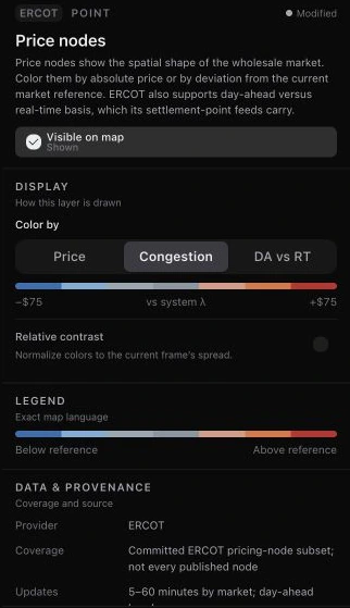
Price nodes can show the market price itself or how one location separates from the rest of the grid: Congestion against system lambda on ERCOT, Deviation against the market median elsewhere.
Color ERCOT by congestion
Under Price nodes, Color by → Congestion shades each location by its price relative to ERCOT's system lambda. Cool areas are cheaper than the system-wide energy price; warm areas are more constrained and expensive.
- 1Open Map content and turn on Price nodes.
- 2Open Color by and choose Congestion.
- 3Use the timeline to replay how the separation moves through the day.
This is an observational market-price view built from ERCOT public data, not a power-flow model.
Compare day-ahead with real time
On the ERCOT map, DA vs RT colors each node by how differently congestion settled in real time from what the day-ahead market priced. Relative contrast rescales colors to the current frame's spread when absolute differences are small.
Read a congestion path
Congestion path is a map tool that reads two settlement locations as a directed source-to-sink pair. It works in ERCOT, ISO-NE, MISO, NYISO, PJM, and SPP; the evidence behind each read depends on what that market publishes.
Choose the source first
Open Congestion path in the map rail. Shift-click the site's settlement point, then the point it settles against. The first selection is the source and the second is the sink. Basis is source minus sink: a negative value means the source earns less than the sink. Use Reverse to swap the direction.
- 1Open a supported market's map and choose Congestion path.
- 2Shift-click the source settlement point, then the sink.
- 3Check the pair and direction before reading the result.
Keep the position and evidence attached
Review the stated position size, time basis, and source evidence with the path's assessment. The constraint ranking is measured; the week-ahead call is not validated and the filed-outage view remains unproven. Constraint attribution and the outlook depend on the evidence available for that market. A path between two price locations is not a physical transmission route. Where public transmission-outage evidence is unavailable, the panel keeps that gap explicit rather than treating it as an empty schedule.
Type a pair instead
When you know the settlement points by name, open Congestion path and choose Or type the pair by name, or go to askthegrid.com/assets/compare and choose Congestion path. Enter the source, then the sink; the path opens on the comparison page for those two locations.
Return to a pair
Save path keeps the directed pair available from the tool's saved paths. Use its alert action to carry the pair into monitoring setup, or its comparison link to inspect the same locations beside their price statistics. Review the rule before enabling delivery.
Select & focus
Click to select
Click an asset to open its info card. Selecting another asset replaces the current single selection.
Box, lasso, and additive selection
With a free account, Shift+drag draws a box around visible assets, the Lasso tool in the map's top-left corner traces a freehand area, and Shift+click adds or removes one asset without replacing the others. The multi-selection card and agent receive the complete selected set. On a market map, when two to four selections are all power plants or all compatible price locations, choose Compare to keep their selection order and shared fields together. Mixed physical and market-location selections remain on the map.
Drop a pin
With a free account, choose Drop a pin in the map's top-left corner and click anywhere, or right-click the map and choose Drop a pin here. The agent uses the pin as a focus point—handy for "what's near here?" questions.
Read the grid at a point
Right-click the map and choose What's here, or open the Here tool and click empty ground. The panel shows the point's load zone, the nearest settlement points with their latest prices, zone demand against its forecast, weather at that cell, the nearest plants, and nearby grid events, with every chart following the timeline. Keep as pin turns the point into a pin.
Basemap & camera
Choose Map or Satellite in Basemap settings, and zoom or pan freely. Show other ISOs in the same settings hides or restores the neighboring ISO footprints and operator marks used to switch markets; they are shown by default. From an info card, Zoom to asset frames that asset.
Search the grid
Find anything by name
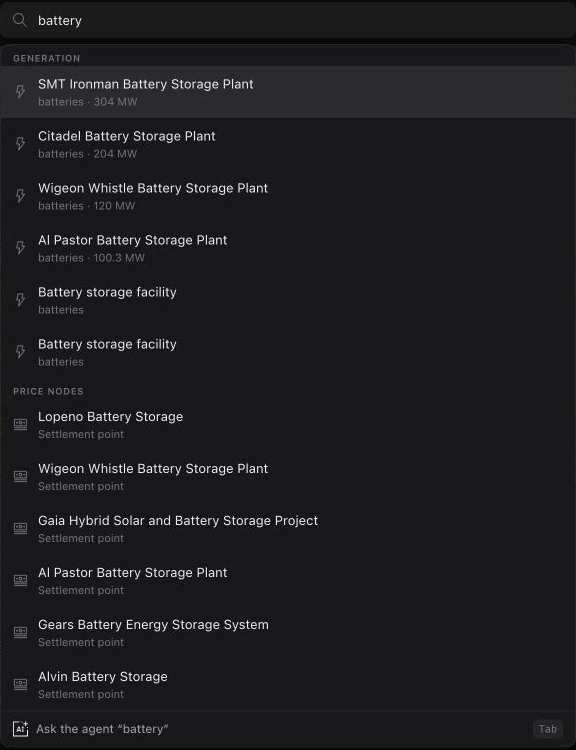
Search across zones, generation, data centers, price nodes, substations, transmission lines, interconnection queue projects, and infrastructure overlays. Results are grouped by kind.
- 1Press / to focus search, or ⌘K to go anywhere in the product — ⌘K finds this market's nodes, plants and substations too, and on a radar it lists that cockpit's desks.
- 2Type a name and pick a result to fly to it on the map.
- 3Or press Tab to send your query to the agent instead.
Did this guide get you unstuck?
One click is enough. No message or account required.