September on Ask the Grid
Two new grids, a price forecast you can see the shape of, congestion between any two points, and a map that knows more about what sits around an asset.
James LePageOctober 5, 20269 min read

September made Ask the Grid bigger and deeper at the same time. Two grids joined the map: Bonneville, with the Columbia River hydro system behind it, and Baja California, on the other side of the border. Metis 1 Preview moved into the price charts, so you can see the whole distribution of where prices could go, and click back to any past hour to see what the model expected before it happened. And the map learned a lot more about what sits around an asset: the node a plant settles at, the dam's live operations, the river above it.
The thread through all of it is that the pieces now work as one system. Grid data, Metis forecasts and the grid agent sit on the same foundation, so foresight turns into an answer you can ask for, and every answer can be checked against what actually happened. A forecast is something you can question, a point on the map becomes a question, and history is always one click back.
This post walks through the month in the product itself. Every clip is a real session on live market data, recorded on October 4 and 5.
01
A forecast you can see the shape of
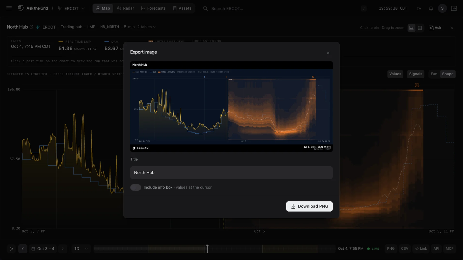
Select any hub on the map and its card already shows the outlook: real-time prices up to now, then the Metis 1 Preview forecast as a band of light. Expand it and Chart Studio takes the whole screen.
Brighter is likelier. Each interval carries a full probability distribution rather than one line, so you can see where the model puts its weight, how wide the plausible range gets through the evening, and whether there is a tail toward a spike. Hover anywhere and the values strip reads out the quantiles from p05 to p95 beside the real-time price and the cleared day-ahead price. Fan redraws the same forecast as nested bands.
Turn on Forecast volatility in Map content and the same uncertainty becomes a map. Color is the width of every node's p10 to p90 band from the latest run, so scrubbing the timeline forward shows where and when the model is least sure of price, from a single node up to the whole grid.
History is where it gets useful. Click any past time and the chart redraws the run that was newest at that moment, with its p05 to p95 range, so the price that actually printed runs straight through the forecast published before it. It is a quick way to build a feel for when to trust a forecast and when to lean against it.
Chart Studio works the same way for every price chart, forecast or not. The Data view lists every plotted value with its timestamp, and for a forecast its issue time. The footer carries CSV, a PNG export with a preview, a link back to the exact view, and ready-made API and MCP calls for the same series. Ask hands the chart to the grid agent. The Chart Studio chapter has the full tour.
We also publish how the model does. Every 15 minutes, the forecast accuracy page checks how often the real-time price landed inside Metis 1 Preview's p10 to p90 range and how wide that range was, beside the operators' own demand, wind and solar forecasts. The forecasting guide explains how to read a distribution, and Metis 1 Preview describes the model.
02
Two more grids: Bonneville and Baja California
Bonneville is a balancing authority, not an ISO, and its system is water. Its Radar desk brings together BPA's own load and generation, the WEIM real-time price CAISO publishes at Bonneville, and hourly operations at thirteen Columbia and Snake River projects, from Grand Coulee down to Bonneville Dam: outflow, spill and forebay elevation, as the operating agencies report them.
Baja California runs on CENACE's market and is tied to California rather than to the rest of Mexico. Its desk shows CENACE's demand against CENACE's own forecast, and day-ahead zonal prices for Tijuana, Mexicali, Ensenada and San Luis Río Colorado. CENACE prices in pesos; we convert them at the FRED daily exchange rate so both sides of the border read in dollars.
Both are on the map, in Radar and in the agent, beside the seven organized markets. The Bonneville chapter covers the hydro desk in more depth.
03
The whole country, interval by interval
The national map puts every grid we cover on one canvas: nine of them, with their boundaries, transmission, hubs and thousands of pricing locations, each colored by its latest price on its own operator's clock. Drag the timeline and the country recolors as each market publishes.
The seams are on the map too. Flows between grids are drawn as arrows where the interfaces cross, and each card carries the operator's signed flow and the real-time price on each side of the seam. The flows chapter covers which interfaces are published and by whom.
And any spot can be a starting point. Drop a pin and Here gives it a grid identity: the market and load zone it falls in, the nearest prices, demand, weather, plants, river gauges and recent events. For a site that begins as coordinates, that is the first look at the grid around it. The map guide covers every layer and tool.
04
Congestion between any two points
Every project has two prices that matter: where it sits and where it settles. Select one hub, shift-click another, and the congestion path opens between them, with a dashed chord across the map.
It lists the transmission constraints that moved the spread when they bound, priced in dollars per megawatt-hour, and puts a number on a bad day for the position you describe. For West Hub to Houston Hub, with a 20 MW solar profile paid on real-time prices, the fifth-worst of the last 366 priced days cost $7,898. Where the operator publishes planned outages on those lines, they sit beside them.
Watch this basis turns the path into an alert, and Open full comparison puts both ends side by side with their volatility. The congestion path chapter walks through the method.
05
What sits around an asset
A lot of September went into the physical context around a plant or a site, the part that matters most for development and operations.
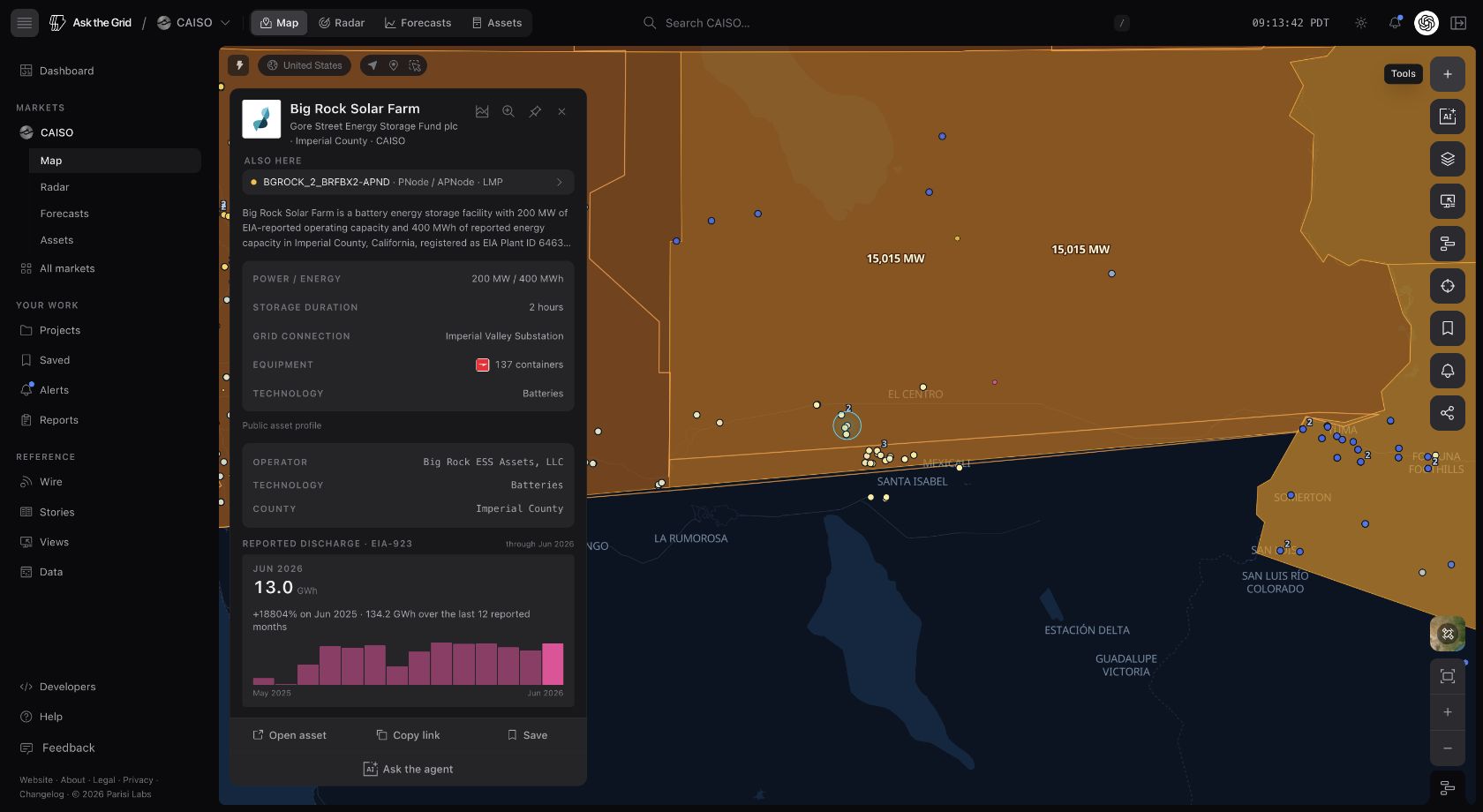
CAISO plant cards now name the plant's market resources and the pricing node it settles at, so a plant's price is one click from the plant.
River gauges became a national layer: stage, flow, flood thresholds and the National Weather Service forecast for each gauge. Hydro plants link to the gauges in their reservoir and below their dam, and a gauge lists the plants nearby. The rivers chapter has more.
Around an asset
06
The agent works from what you are looking at
The grid agent starts from your context: the market, the selection, the chart in front of you. Ask from a hub's card and the hub comes with the question, with suggested questions for that hub already waiting. Ask across markets and it keeps each grid straight. Answers cite their sources, and a chart in an answer opens in Chart Studio like any other.
Answer settings let you set the style and tell it who you are and what you work on, so a trader and a developer can ask the same question and get the answer each of them needs. The agent guide covers what it can reach.
07
Research that keeps going
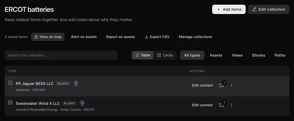
Collections now live on the map. A collection holds a set of assets with your notes and custom fields, and opens geographically with its members marked. The same plant can sit in several collections with different notes, and the Now view shows the findings and postings reaching each of them.
Shared answers carry the question, the answer, its charts and cards to anyone with the link, and the owner can revoke the link at any time.
Alerts and reports came out of beta. An alert starts from whatever you are looking at, a node, a Radar widget, an asset or a collection, and delivers by email, SMS, Slack or Microsoft Teams. Reports turn a recurring question into an edition on a schedule, from a template, with an archive.
And all of it is reachable from your own tools. The developer platform covers forecasts, data and the agent, and the MCP server lets a compatible AI client search the catalog, read exact schemas and run bounded queries against the same grid data.
Keep it, share it, watch it
08
Who joined in September
Close to 300 people signed up in September, from nearly 90 organizations: utilities and public power agencies, renewable developers and storage operators, trading desks and power marketers, investors, analytics companies and research universities.
The fifty most active users came back on a median of eight or nine days in the month, and they used the pieces together. Two thirds of them asked the grid agent, more than 420 questions between them, and most of those also worked from an asset profile or a Radar desk. Ten connected their own AI tools through MCP and made more than 2,600 tool calls.
What they reached for depended on the seat. Utility teams worked from Radar and the agent, reading operating conditions and asking about them. Developers and storage operators lived in asset profiles, the timeline and congestion paths, checking a site or a plant against its prices. Trading desks and investors watched Radar desks and pulled the same data into their own tools through MCP.
09
What's next
A project carries a longer story than any single question: an interconnection study, a revenue case, a change in local grid conditions, all bearing on one decision. Projects gives that story a room, and we are opening it to a small number of teams first, starting with diligence, development, interconnection and operations.
Metis 1 Preview is the first visible piece of the larger thing we are building at Parisi Labs: world models for physical systems, starting with energy, that can explore possible futures and the effects of different actions. Ask the Grid is the system explorer for energy, where that work meets live markets, infrastructure and weather. The Parisi Labs thesis lays out the direction.
There is a lot more to build. But the system explorer for energy is a lot bigger, and a lot more connected, than it was on September 1.